In brief, Vargic’s mapping of the World Wide Web is an earthbound rendering of the cloud—or, more accurately, of the clouds that comprise what we call the cloud.

Martin Vargic (creative commons)
Vargic describes himself as an “artist and graphic designer from Slovakia specializing in unique conceptual maps and interesting posters + infographics.” On his website, www.halcyonmaps.com, there’s evidence of the range of his data visualizations.
There’s a map of England’s landmass after the projected sea-level rise from global warming, and a map titled Cats and Dogs that shows the countries of the world that favor cats (blue) and those that favor dogs (red). Among his other infographics, there’s an interesting display of sunsets on Earth, first with our sun, and then what the sunset would look like with 10 other stars in our galaxy in the place of the sun.
But why would anyone want a Map of the Internet when Google, Baidu, Bing, and others have already cataloged and sorted all the registered sites available in single-tap searches? The difference is that the search engines return lists of content and addresses. Vargic’s global map provides the addresses in a Mercator projection that rates and groups the major landing points online.
Seeing the web this way reaches the viewer on a more immediate level, just as totals presented in bar graphs and percentages presented in proportional slices of a circle are more immediate and somehow easier to comprehend. While our senses are primal, language and numbers are abstract and at a level removed. Consider the distance between the written notes of a musical composition and the sound of those same notes in performance. The notes and the sounds are the same on one level of perception, but not even close on another.
ORGANIZING THE INFORMATION
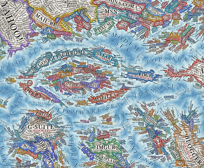
Colors, locations, groupings, and relative size of the sites and objects on the map are metaphorical—chosen to elicit an “OK, I see” as the appropriate acknowledgment of understanding the data. Color schemes of the websites designate the dominant colors of the site’s interface or logo. The relative territorial sizes of the sites indicate popularity, with the information provided by the Alexa web traffic ranking between January 2020 and January 2021. Take the archipelago of search and browser sites as an example.
It’s obvious who the leaders are, and there’s even some history when you compare this version of the map with previous versions. And the collection of these sites is intentionally placed at the center of Vargic’s globe. A closer look at what the search engines are surrounding reveals what’s at the center. Those are the internet service providers and browsers, which Vargic says “form the core and backbone of the internet as we know it.”
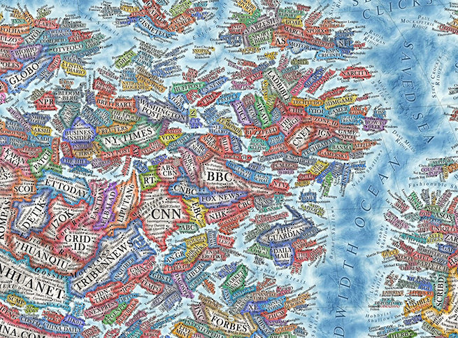
As you look around the globe, you’ll notice groupings of “countries” that share essential cultures and purpose: news sites, social networks, e-commerce, file sharing, software companies, and more. These form regions and continents all over the map.

A section of the news continent.
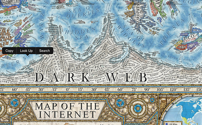
Where these regions appear can also be relevant. The dark web has been relegated to one of the least explored of all places on earth. Where we expect to find the Antarctic continent on our conventional globes, there’s the anonymous mail services TorGuerillaMail, OnionShare, and the more sinister hacker sites.
And these are just the larger outlines. The large amount of detail included in the data that’s mapped into the landscape includes services and people. Vargic explains, “[M]any features and services provided by these websites, their sections and content categories, as well as distinct content creators, are labeled as cities and towns (which number well over 10 thousand).”
Website founders and CEOs are shown special consideration and are identified as capital cities. “Mountains, hills, seas and valleys represent a wide variety of aspects of the internet, its culture and computer science overall, while almost a hundred of some of the most important internet and computing pioneers are also featured on the map in the names of underwater ridges” that still direct significant undercurrents.
AND MORE
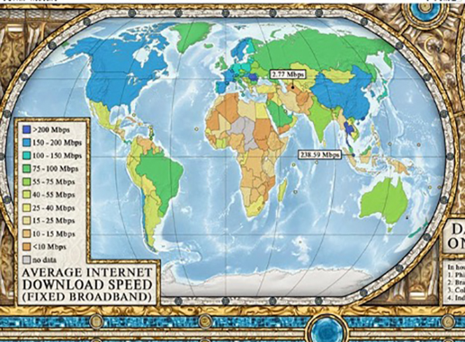
If you look at the large image of the map above, you’ll notice six additional small maps wrapping around the bottom. This is one of those, and it charts download speeds in different countries.
And the fine-print columns all around the central map are lists of information that include most popular websites, top website languages, largest IT companies by revenue, top channels on YouTube, most expensive domain sales, and daily time spent on social media by country.
As a rather large one-page resource, the amount of information included on the Map of the Internet is certainly impressive. Magellan would have been proud.


