This new trend is primarily the result of exponential growth in data that must be provided to decision makers on an increasing variety of smartphones and tablets with different screen sizes. Data visualization plays an increasingly important role here as it must ensure that important relationships can be identified correctly and quickly from the abundance of information that prevails in the era of Big Data.
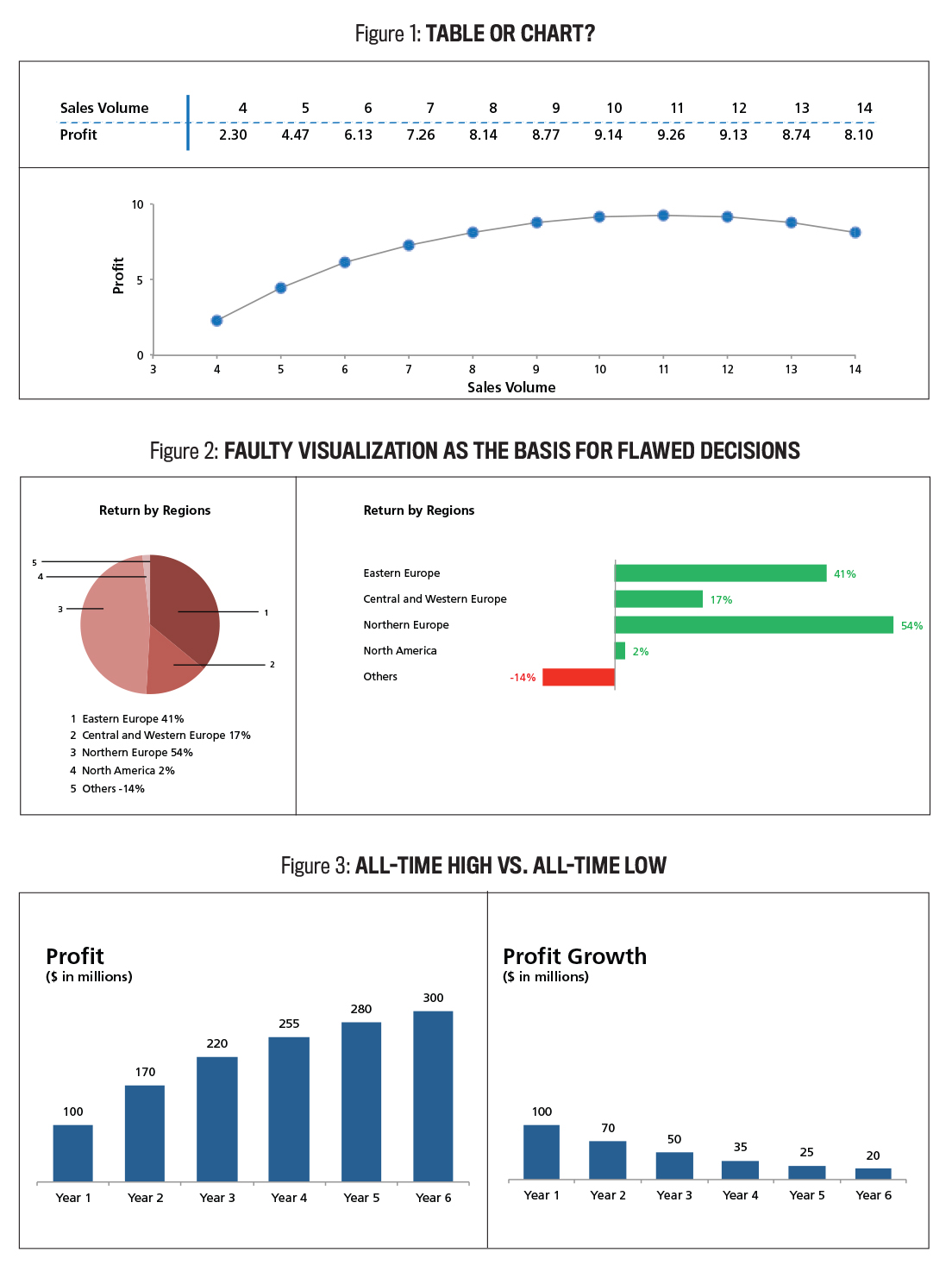
Each method of displaying information has its own strengths and weaknesses. Charts, for example, are easier for the human brain to comprehend. Figure 1 shows how much easier it is to discern the trend among data points if they are presented in a chart instead of a table.
Charts provide an easily understandable way to present developments, relationships, or contexts, but they are difficult to prepare correctly. If you use the incorrect type of chart, misinterpretations can easily occur. The pie chart in Figure 2—taken from an annual report of a listed company—seems to show four positive regions; the negative region (Others) becomes apparent only after you’ve reviewed the legend thoroughly. In contrast, the bar chart relays the same information in a more transparent and immediate manner.
The interpretations by decision makers can be highly influenced not only by the type of visualization but also by what storyline is emphasized or the “messages being conveyed,” as Figure 3 shows. Both charts focus on profit but lead to completely contrary conclusions. While the chart on the left conveys a positive message (record profit) because profit is shown as rising, the chart on the right depicts the exact opposite (lowest-ever profit growth). In year 6, the company increases profit by only $20 million compared to much higher growth in years 1 to 5. In the left side of the chart, you can see the diminishing growth, but we don’t show the annual growth. Rather, we show annual profit as a result of all previous growth.
The preceding examples provide a brief demonstration of the enormous influence the design of reporting has on the readability and true and fair view of reports. The fundamental issue isn’t to present the information in a more appealing manner but to ensure the quality of information for decision-making purposes. The design of a report has direct consequences on how decision makers interpret its contents. Management accountants need to be aware of these effects when they design their reports.
LIMITED RELIABLE GUIDANCE
Faculty, practitioners, and consultants generally agree that good reporting design follows three overall principles: simplicity, clarity, and standardization. Simple representations aim to focus the report reader’s concentration on the essentials. Clarity—the use of precise, clear formats—is needed to avoid uncertainties and misunderstandings when decision makers interpret the data. Standardization means preparing the same, recurring information in an identical manner since the more frequently information is presented in the same format, the faster and easier it is for the report recipient to comprehend. The development of a global standard, the IBCS (International Business Communication Standards) format, is the most radical form of standardization. But a global standard doesn’t take into account the differences in the way human beings process information. The meaning of simplicity, clarity, and standardization varies considerably from person to person and usually can’t be proven objectively, either. To solve that dilemma, companies are increasingly turning to a new, promising approach to test generally accepted methods to improve report comprehension—eye tracking.
NEW INSIGHTS THROUGH EYE TRACKING
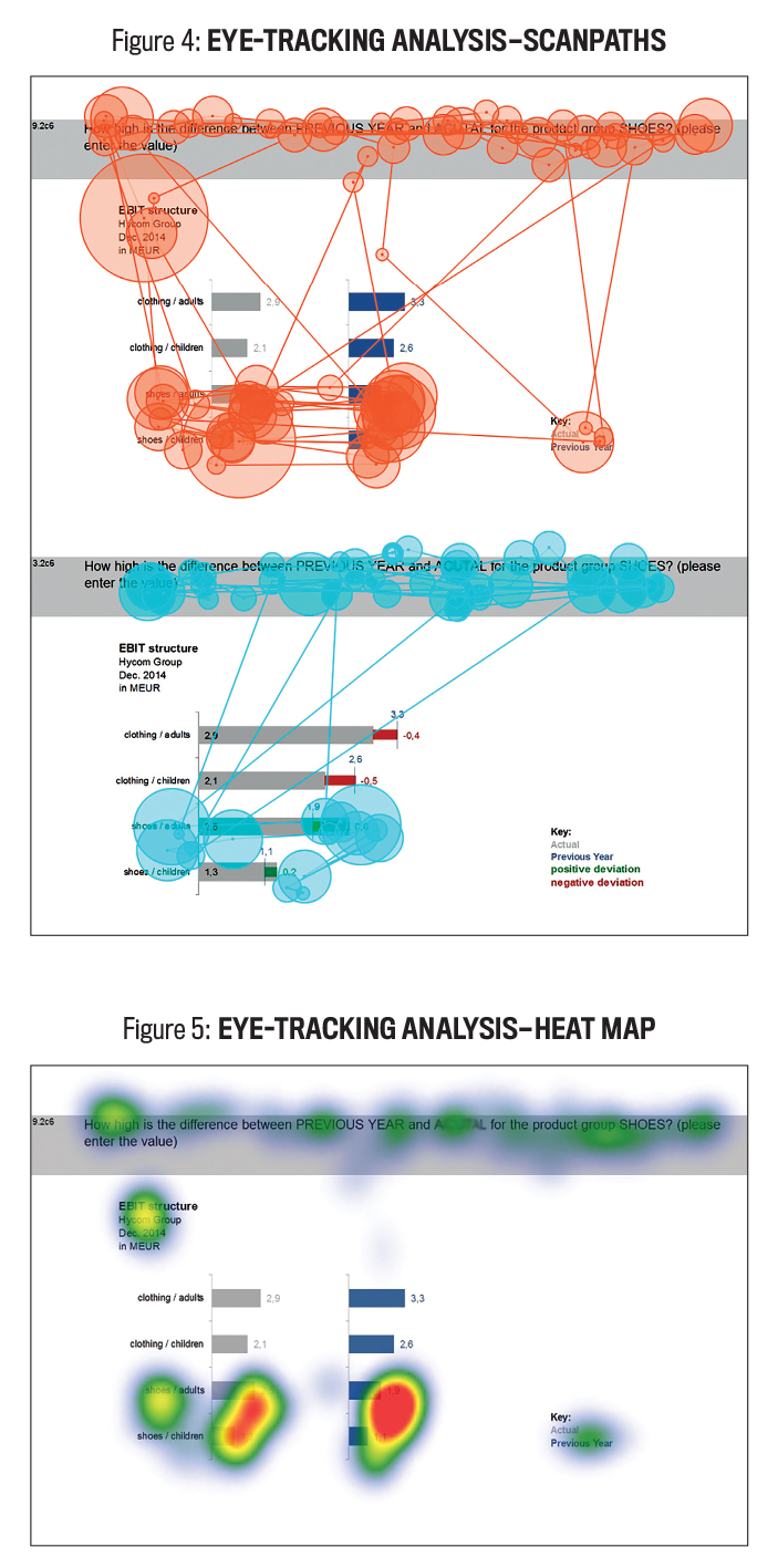
Eye tracking analyzes the eye movements (also called scanpaths) of people who are reading a report. These scanpaths make the visual perception of the report reader transparent and provide a method to objectively measure the effectiveness of different representation formats. Recordings of eye movements are divided into fixations and saccades. Fixations show the amount of time that eyes dwell on a certain point. They are depicted by circles, as seen in Figure 4, whereby the larger the circle, the longer the view. Saccades show the change of view and are represented by lines. Together, fixations and saccades form a person’s scanpath and show how a specific individual analyzes the report in a view-by-view manner. Figure 4 shows two different ways to present the actual/budget analysis of EBIT (earnings before interest and taxes) by product groups. The two bar charts at the top of the figure have a lot more saccades, which means that numerous views are necessary since the reader’s eyes are constantly swinging back and forth, right and left, and to the legend in order to make a comparison. In contrast, the scanpaths of the two bar charts at the bottom of the figure that use red and green colors show that the representation is much easier to understand, as indicated by the fewer circles (fixations) and lines (saccades).
Click to enlarge.
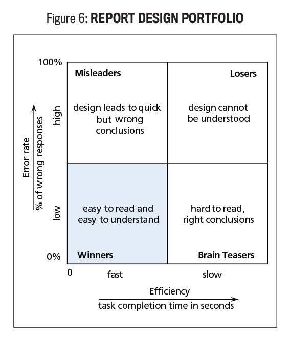
Scanpaths can be condensed into focus or heat maps by superimposing the scanpaths of many people. The red and yellow sections in Figure 5 show the parts of the report with the most views. Heat and focus maps therefore provide an overview showing where readers’ attention is directed in total. Figure 5 indicates, for example, that, when viewing the charts, people are only looking at the numbers of the direct captions, not the bars that reflect the proportions. This is significant since it could lead to the reader’s missing the most important key message.
ASSESSING THE REPORT DESIGN
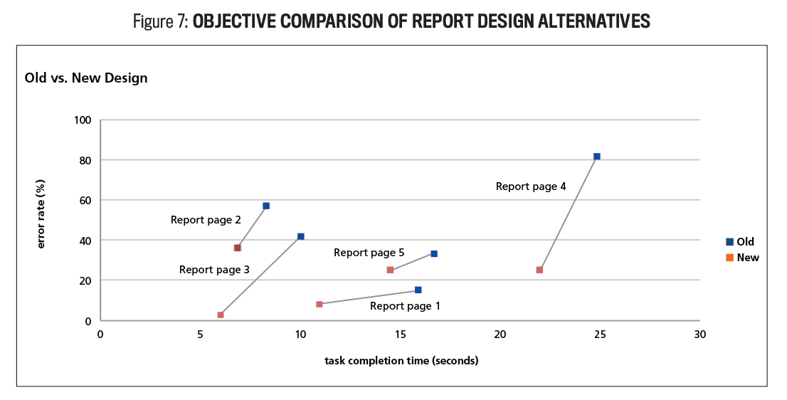
When can you say that the design of a report is objectively good and better than the alternatives? To answer this question, you can use two key criteria as shown in Figure 6:
* Effectiveness—Can report readers draw the right conclusions from the representation? The metric equals the number of incorrect responses: The higher the share of incorrect responses, the lower the effectiveness. The lower the error rate, the higher the effectiveness.
* Efficiency—How much time do report readers need to draw their conclusions? The metric is the response time in seconds; the longer the report readers need to draw their conclusions, the lower the efficiency.
To find the best possible representation, you need to look at eye-tracking analyses that result from showing several reporting design alternatives to the report readers and compare and analyze them statistically. Ideally, you’ll find a representation format that’s highly effective (high degree of accurate understanding by the readers) and highly efficient (the shortest amount of time required for the reader to comprehend) for the majority. Figure 7 shows the findings of a report optimization project in which the original report format (old) and an alternative representation format (new) were tested in a direct comparison. The old, original report was found to have an error rate of more than 80%, meaning that it was difficult for the reader to come to the correct conclusion. The new, alternative format was able to boost both effectiveness and efficiency as shown by the decrease in error rate and time required.
INSIGHTS AND RECOMMENDATIONS
Eye tracking makes it possible to measure the effectiveness and efficiency of different representation formats objectively. There are several general design principles that can be derived from the more than 1,000 reporting-design experiments the University of Applied Sciences Upper Austria, Steyr campus has carried out with eye tracking so far:
- Charts are usually better for complex tasks when very large amounts of data are involved. Charts also attract more attention from the reader, and readers remember them better.
- The best report format sometimes depends on the personality of the reader. In the eye-tracking experiments, personalities were first assessed using the Big-Five Inventory, which ranks personalities on the five dimensions of extraversion, agreeableness, conscientiousness, neuroticism, and openness (see Samuel D. Gosling, Peter J. Rentfrow, and William B. Swann, Jr., “A very brief measure of the Big-Five personality domains,” Journal of Research in Personality, April 2003, pp. 504-528). Here are two examples:
- Conscientious people prefer tables, yet they can perform equally well with both tables and charts. They usually take longer to analyze visual aids because they tend to be more detail oriented and accurate.
- Extroverted people say they want more visuals because they tend to think more broadly (“the big picture”), but they may actually perform better with tables because it forces them to look at the details.
- The optimal representation format in a certain situation might also depend on culture. Our experiments show differences between Asian and Western cultures. For example, in the Asia-Pacific region, tables are often more effective while, in Europe, charts are more favored. Asians generally also prefer more colors in their reports than European readers do.
- Familiarity with the respective reporting formats has a significant influence on comprehension and the resulting ability to make decisions. For example, the research clearly showed a “reporting experience curve.” Readers are able to analyze reports faster over time if the visual representation doesn’t change.
The starting point of all perception-optimized reporting is a clear understanding of the report’s purpose. Without knowing why which information is being presented, reporting designs can achieve a suboptimal result at best. It’s also important to keep in mind that there are significant personal and cultural differences. In practice, therefore, there’s no one optimal report for everyone, but you can try to come to the best possible compromise for the intended group of recipients. To design reports well, first follow these four key steps:
- Select the appropriate type of visualization (e.g., table or chart) for the individual report elements according to the type of information, the purpose of the report, the preferences of the readers, and so on.
- Create the best possible “technical” design of the individual report elements (simplicity, clarity).
- Determine the optimal positioning or arrangement of the report elements in the overall report and on the respective report page.
- Set company-specific standardization of the visualization and positioning of the report elements as much as possible. Using standard templates leads to effective and efficient interpretation in the long-term memory of the reader. In addition, standardization also contributes to a more efficient report-generation process.
LEARN MORE ABOUT EYE TRACKING
As we hope you’ve seen, the right form of visual representation is becoming increasingly important in the era of Big Data and smartphones. To this end, designing reports with the help of eye tracking is a new approach that leads to measurable improvements in readability together with a considerable acceleration in the process to come to better decisions. Keep in mind, however, that there’s no one-size-fits-all solution when it comes to reporting design. Management accountants should at least try to ensure that they’re following objectively proven principles to improve effectiveness and efficiency as much as possible when designing their reports. For more information about report design and eye tracking, please email the authors.
CASE STUDY: voestalpine Steel Division
To illustrate the benefits of eye tracking, Heimo Losbichler recently spoke with Pauline Seidermann, CFO of voestalpine Steel Division, on how her company improved its reporting design using this state-of-the-art methodology. voestalpine Steel Division is one of four divisions of the voestalpine group with more than €3.75 billion sales and 10,000 employees. Seidermann, who is responsible for Finance and Controlling, HR, Legal, and Compliance, among other departments at the Steel Division, oversaw a recent initiative to improve internal management reporting.

Pauline Seidermann, CFO of voestalpine Steel Division
Heimo Losbichler: Could you briefly describe the project where you used eye-tracking research?
Pauline Seidermann: The project was to see if and how we could objectively improve an existing internal management report, which was around 30 pages including graphs and diagrams. The goal of the project was not to change the report fundamentally but to modify and improve the design where possible.
Losbichler: Why did you turn to eye tracking for this project?
Seidermann: Until now, we had to rely on subjective feedback of the management, so we were often facing personal preferences which had to do more with aesthetics. Controllers had to guess whether a proposed design change would result in real improvement desired or just look new and different. What was happening was an inefficient trial-and-error process to improve reports that often required several rounds of changes.
Losbichler: Exactly how did you involve eye tracking in the project?
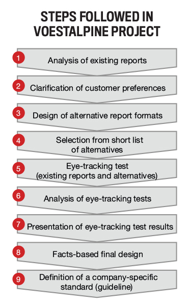
Seidermann: In the first step, the existing report was analyzed by the visual design experts at University of Applied Sciences Steyr. They proposed improvements and helped make our preferences (colors, types of graphics, the boldness of information, and so on) more specific. Based on our preferences, they created alternative designs for each page of the report, and then we chose the most promising ones. The chosen layouts were then compared to the existing reports with the eye-tracking test in an objective manner.
Losbichler: Can you describe how the actual eye-tracking test was conducted? Was it a complicated process?
Seidermann: We decided not to carry out the test with an external focus group but with a group of real report readers from inside our company. Around 20 people (CFO, senior leaders, controllers, etc.) were shown different reports and then given tasks where they had to answer objective questions within 30 minutes. For instance, they were asked, “In which product area is earning performance the highest?” The participants were wearing eye-tracking measurement devices as they looked at the reports. The eye-tracking test was not only simple to carry out, but also interesting for the participants, since we were able to show them their individual eye movements and scanpaths with a video at the end of the test. Having a video of the actual results led to higher buy-in of the whole initiative and was one of the critical success factors in the final acceptance of the new reporting design.
Losbichler: In addition to helping to increase user buy-in, how did the eye-tracking tests help?
Seidermann: After we presented the collected results to the participants, we were able to have a more open, constructive, and efficient debate on the new designs. The issue wasn’t just about aesthetics or subjective preferences anymore—i.e., how “beautiful” each of us found the report—but about objectively selecting attributes among design alternatives which will help increase comprehension for the majority. After these were selected, we were then able to successfully introduce the new report to the senior leaders. Our executives are delighted with the new design as it is easier to read and shows them the most relevant information at first glance.
Losbichler: Aside from eye tracking’s contribution to the project to improve your management report, were there any other learnings or benefits that you experienced?
Seidermann: The analysis we carried out during the eye-tracking project showed us how senior leaders read the management reports, which presentation formats attracted their attention most, which diagrams were easier or more difficult to read, and how layouts supported (or detracted from) the reader’s comprehension. The whole process has helped us increase our understanding of finance storytelling skills and provided us with reliable results to guide future report improvements.

October 2017


