Given the speed and volume of data collection in business, managers need ways to make sense of large sets of data to help inform decision making and to help communicate results. Data visualization is a powerful tool that can be used to both facilitate and influence decision making. The power of data visualization is in the ability to identify what might have otherwise gone undetected. It not only helps to make sense of large sets of data but can also help to uncover patterns or trends that might otherwise go undetected.
There are two types of data visualizations used in management accounting:
- Exploratory visualizations help provide insights into business performance.
- Explanatory visualizations help managers communicate the results of their analyses to influence changes and improvements.
Exploratory visualizations are used when you want or need to explore data to find insights. You use these types of visualizations to help better understand your underlying data.
Explanatory visualizations are used to communicate the results of your analyses. Well-designed explanatory visualizations convey the results of your analyses in a clear and concise manner. The goal of explanatory data visualization is to communicate findings and inspire action. In this adapted excerpt from the IMA® (Institute of Management Accountants) Statement on Management Accounting Data Visualization, we’ll take a closer look at the work and process that go into creating explanatory data visualizations (see Figure 1).
PREPARATION STAGE
The first three steps in the explanatory data visualization process can be thought of as the preparation stage. Here you’re making sure you have the right data and that it meets the criteria for the analysis. You’re also considering the purpose of the analysis and for whom the analysis is being prepared.
Step 1: Verify the data. The importance of this can’t be overemphasized. The adage “garbage in, garbage out” is relevant in all data analyses, including data visualization. If the data you’re using for your visualizations is incorrect or incomplete, your visualizations will also be incorrect and potentially misleading. Data should meet the following criteria:
- Accuracy: Are the data error-free?
- Completeness: Do you have all the data?
- Consistency: Are the data in a consistent format?
- Freshness: Are the data the most recent data available?
- Timeliness: Will the data you need be accessible and available?
Accuracy of the data means that the data are error-free, reliable, and representative of the phenomenon you’ll be presenting in the visualization. Completeness of data means that you have all the data that you need and aren’t missing any data. Consistency of data means there are no format inconsistencies. For example, dates are formatted the same way from period to period, and values are in the same denomination across time periods. Freshness of data means that you’re using the most recent data in your visualizations. Finally, timeliness means that the data you need for your visualization will be available and accessible when you need it.
Step 2: Define the purpose. Before creating your explanatory data visualizations, be sure you have specifically identified the purpose of your analysis. During the exploratory phase of analysis, you’ll likely have identified your overall purpose and prepared many visualizations as part of your discovery process. It’s very tempting to use every visualization that you created during the exploratory phase. Avoid falling into this trap. The purpose of exploration is to find insights. Your goal is to share with your audience the insights, not the entire journey you took to develop them.
Stephen Few, in his book Show Me the Numbers (Analytics Press, El Dorado Hills, Calif., 2004), identifies four purposes for tables and graphs of quantitative business information:
- Analyzing
- Communicating
- Monitoring
- Planning
Think about your purpose and choose only the visualizations that align with that purpose. Also consider the audience for your data visualizations. For example, is the purpose to inform the audience or to persuade the audience?
Step 3: Consider the audience. When preparing visualizations, always keep in mind the audience that will be viewing the visualization: Who will be consuming the information? How much background do they have regarding the topic? Will they be the decision maker?
Answering these questions will help you focus your visualizations so that they achieve maximum impact. For example, if you prepared an analysis that will be shared internally with colleagues who know the background information related to the analysis, you don’t need to include a lot of background information. But if the analysis is prepared for an audience unfamiliar with the topic, more detailed background information will need to be provided for them to understand the analysis. An important aspect of providing an analysis that your audience will understand is to be sure to pick an effective visualization.
CREATION STAGE
Once you’re confident about your data, have clearly defined the purpose of the analysis, and know your audience, you can begin to create the visualizations to convey your results. In this stage, you’re choosing an effective visual, using best practices, and telling a story to effectively convey your results.
Step 4: Pick an effective visual. Picking an effective visual is easier said than done. Most of us have never been trained in data visualization and have little knowledge as to what type of visual is most effective. It helps to break this down into the following:
- Consider the purpose of your analysis.
- Identify visuals that will meet that purpose.
- Understand the data that’s needed to create the visual you would like.
- Match the purpose and the data to the appropriate visual.
- Be sure to follow best practices for your chosen visual.
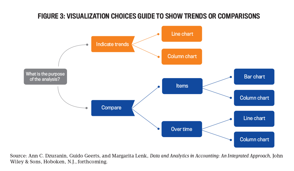
Determining the purpose of the analysis is critical so that you can pick an effective visual. There are many potential purposes for data analysis. Figure 2 is a decision tree that provides a way to identify appropriate visualizations if the purpose of the analysis is to show composition, relationships, or distributions. Figure 3 provides guidance when the purpose is to show trends or comparisons.
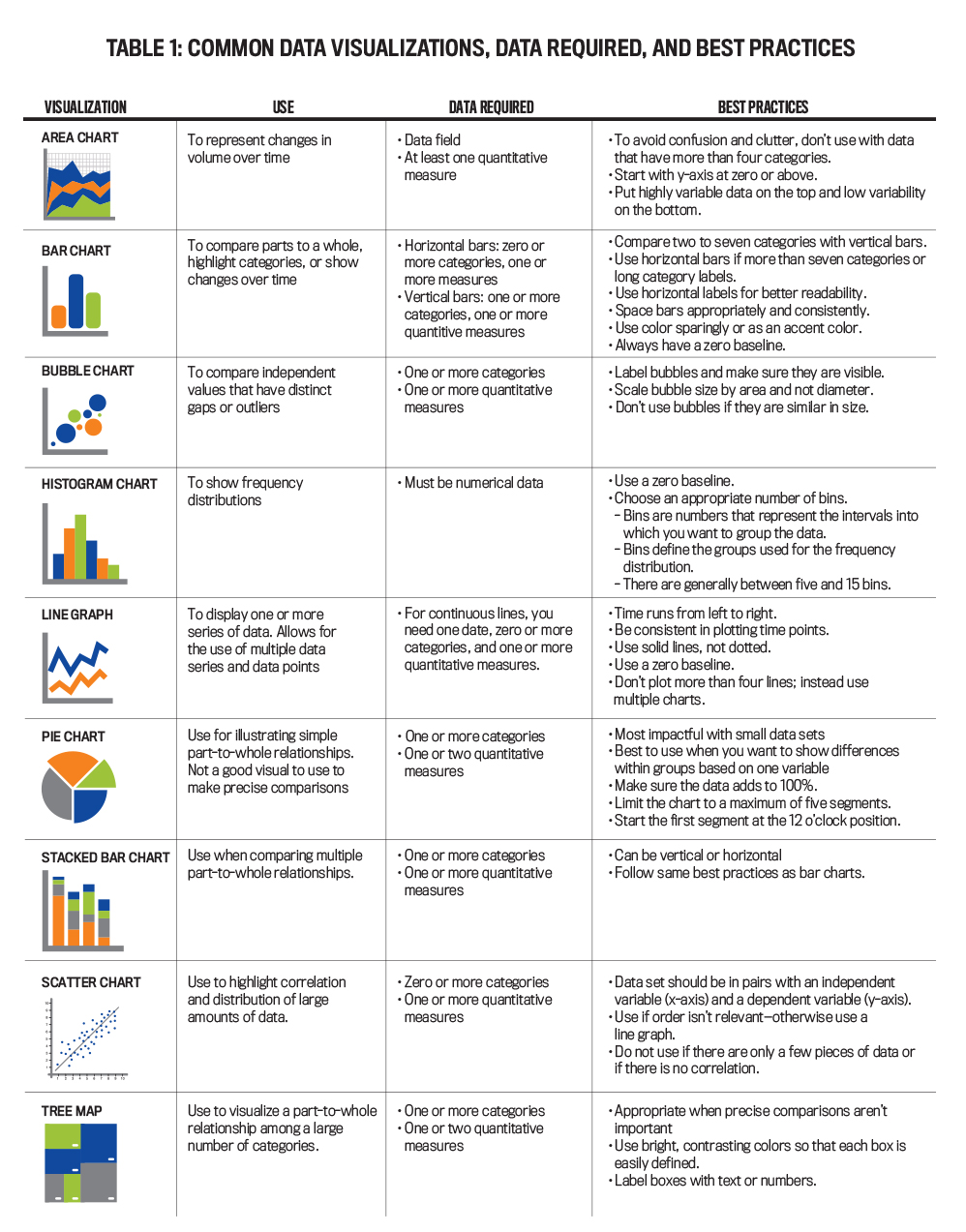
Once you have identified your purpose, you can then narrow down to the types of appropriate visualizations. At this point, you’ll need to be sure you understand the type of data required for the possible visualizations. The best visualization will be the one that matches the purpose and works with the data that you need to visualize. Finally, you should follow best practices for the type of visualization that you decide to use. Table 1 provides an explanation of each type of visualization, how it’s used, the type of data needed, and best practices.
Once you have chosen the type of visualization, there’s still work to do to create an effective visualization. Edward Tufte, a pioneer in the field of data visualization, states that “excellence in statistical graphics consists of complex ideas communicated with clarity, precision and efficiency” (The Visual Display of Quantitative Information, second edition, Graphics Press, Cheshire, Conn., 2001). Tufte goes on to say that a well-designed data visualization should give the viewer “the greatest number of ideas in the shortest time with the least ink in the smallest space.”
Step 5: Follow best practices. Along with the best practices based on the type of visualization, there are a couple of other important practices to consider.
The first is to avoid cluttering your visual with nonessential information. Clutter is the enemy of a good visualization. Tufte recommends maximizing the data-to-ink ratio, meaning you should remove any nondata-related ink and any redundant ink. Basically, when it comes to the amount of ink in a visualization, less is more.
The second important practice is to help the audience focus its attention on what is most important in the visualization. It’s important to keep in mind preattentive attributes when creating explanatory data visualizations. Preattentive attributes are visual properties that we notice without realizing we’re doing so. Attributes such as size, color, and position can be leveraged to help direct your audience’s attention to where you want them to focus. Studies have shown that an audience will spend only three to eight seconds to decide whether they want to continue to look at a visualization or turn their attention to something else (Cole Nussbaumer Knaflic, Storytelling with Data, John Wiley & Sons, Hoboken, N.J., 2015).
Size is an indication of importance. When creating visualizations, keep in mind that relative size will be interpreted as relative importance. This is true in individual visualizations as well as in dashboards. If one aspect of the dashboard is larger than the other aspects, a user’s focus will be on the larger of the images. For example, consider a dashboard showing daily sales volume, sales by model, and a comparison of average net revenue by brand. If the visualization showing daily sales volume is the largest visual in the dashboard, users will be drawn to that aspect of the dashboard first. And given its size relative to the other two visuals, it will appear to be the most important. (Note that it isn’t just the size of the visualization that indicates importance—the size of the text in an illustration relative to other text will indicate importance as well.)
Color should be used sparingly and consistently. A good general rule to consider is that if adding color doesn’t add to the interpretation of the visualization, you likely don’t need to add color. Also keep in mind that color evokes emotion, so be thoughtful of what the tone of the color conveys. For example, red evokes a sense of urgency. In general, avoid using too many colors together in a visualization because it will make it more difficult for the audience to discern what you’re trying to convey. Also keep in mind the view of colorblind users when creating visualizations, as they may have trouble distinguishing between certain colors. For example, avoid relying on color combinations like red and green, blue and purple, or green and blue.
The position of the items in your visualizations and dashboards matters. Most of your audience is going to start at the top left of the visual and then scan with their eyes in a zigzag motion. Therefore, be sure to put the most important information at the top left of the visualization.
Following these best practices will help you to create effective visualizations. The true power of data visualization doesn’t end here. The real power comes when great data visualizations are used to tell a story that the reader will not only remember but act upon.
Step 6: Tell a story. The last step in explanatory data visualization is to tell a story. Storytelling with data is an essential skill for finance professionals (see Fatema El-Wakeel, Loreal Jiles, and Raef Lawson, “Storytelling with Data Visualization,” Strategic Finance, December 2020.
According to cognitive psychologist Jerome Bruner, we are 22 times more likely to remember facts that have been told in a story (Vanessa Boris, “What Makes Storytelling So Effective for Learning?” Harvard Business Publishing, Corporate Learning, December 20, 2017. The reason is that stories are memorable and help us to understand an idea more quickly.
When we hear or read a story, our brains are activated at many levels. The emotional part of the brain releases chemicals to stimulate feelings of connection, reward, and recognition (Pamela Rutledge, “The Psychological Power of Storytelling,” Psychology Today, January 16, 2011. According to Kate Harrison, the powerful combination of data into an engaging story will help to ignite your audience into action (“A Good Presentation Is about Data and Story,” Forbes, January 20, 2015.
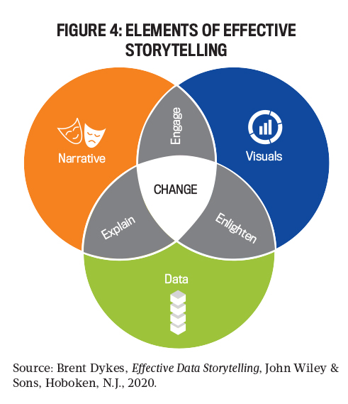
There are three elements to a data story: data, narrative, and visuals. In Effective Data Storytelling (John Wiley & Sons, Hoboken, N.J., 2020), Brent Dykes describes how these elements explain, enlighten, and engage the audience. The combination of all three elements is what leads to change. Figure 4 portrays the connection among the three elements.
The intersection of data and narrative explains your data story. It provides the context and commentary needed to understand the results of your analysis. The intersection of data and visuals enlightens the reader to the insights they may not have had were it not for the visualizations.
The combination of narrative with your visuals engages your audience in the story. Throughout our lives, much of our learning is based on a combination of narrative and visuals. A good story can hold the attention of the reader and increases the likelihood of action.
The key to a good data story is to include all three elements and then to structure your story effectively. You want to be sure you create a memorable and relatable story that leads to action. A best practice for developing your data story is to first create a visual outline of the content you plan to create and use.
Create the outline on paper or a whiteboard rather than starting with creating slides. That will help you avoid getting sucked into creating slide after slide or visual after visual without direction. Although you may believe every visual you created and every step you took in a data analysis is critical, only the key analyses and visuals should be included in the data story.
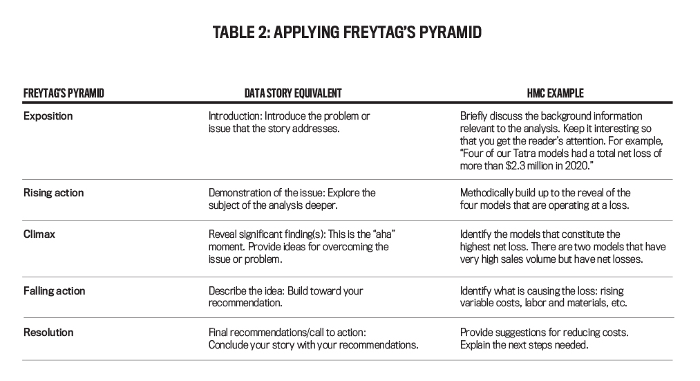
A common structure used in storytelling is called Freytag’s Pyramid, sometimes referred to as a storytelling arc. The pyramid was developed by the German playwright and novelist Gustav Freytag in 1863.
The basic structure begins with the exposition, which introduces the characters and sets the scene for the story. Next, the rising action is introduced via a series of events that build to the most climactic or important point of the story at the top of the pyramid. After the climax, you see the rest of the events that unfold after the main conflict has occurred. Finally, all conflicts are resolved in the conclusion of the story.
How do we apply this structure to a data story? Let’s use the fictitious automobile manufacturing company Huskie Motor Corporation (HMC) as an example (see Table 2). Imagine you have been asked to do an analysis of the model performance for the Tatra brand. The Tatra brand is the lowest average net revenue HMC brand. You need to determine why and make recommendations for improvement.
Following a structure like Freytag’s Pyramid is a clear way to structure your story. Once you have a structure, you can then apply the elements of a story (data, narrative, and visuals) to bring your story to life.
DON’T MISLEAD THE AUDIENCE
An important element in creating any data visualization is to ensure that it isn’t misleading. Unintentionally misleading visualizations are often the result of not following best practices or not providing relative context to the visual, whereas intentionally misleading visualizations are often used to promote a point of view rather than present an unbiased picture. Knowing how to interpret visualizations and spotting potentially misleading visualizations are increasingly important skills.
The following are examples of practices that can mislead the reader:
- Omitting the baseline: If the y-axis of a graph doesn’t begin at 0, it could cause results to look more dramatic than they really are. For instance, in a bar graph with the y-axis beginning at 1,000, a bar showing results of 1,400 would appear twice as big as a bar showing 1,200. If the y-axis began at 0 instead, the difference in size between the bars would be much more appropriate.
- Manipulating the y-axis: The y-axis can also be manipulated in other ways to make changes in the data seem more or less significant. The y-axis scale should be proportionate to the data. For example, using a larger scale can smooth out results and make them appear less volatile.
- Selectively picking the data: Don’t pick only the data points that will provide the story you want to tell. For instance, don’t show the data by year when monthly or quarterly data would provide a clearer illustration of the volatility in the data.
- Using the wrong type of graph: As discussed earlier, comparisons are best shown with bar or column charts. But if you use the wrong visual for comparison, the reader will have difficulty comparing the data.
- Going against conventions: Always be cognizant of standard conventions when creating your visualizations. For example, in the accounting and finance profession, the color red is associated with losses. You wouldn’t want to use red to illustrate gains in a visualization because your readers will assume red means losses.
A NECESSARY SKILL
Whether exploring your data for insights or communicating your insights to others, data visualization can be a powerful tool. The amount of data available to analyze will continue to grow, and the ability to harness that data is necessary to be successful.
Communicating the results and implications of your data analyses is the last step in the data analysis process. For your analysis to be effective, the audience must understand your data story. Following best practices for creating data visualizations and then using those visualiations to tell a story with data can help to create change in your organization and to provide value to your stakeholders. Investing now in building your data visualization skills will reap long-term benefits for your career.

January 2022


