The skills needed to transition to this role of strategic advisor are different than those generally learned in a traditional accounting education. In order to exploit the digital transformation of business, finance and accounting professionals need to be able to explore new ways to manage, analyze, and extract value from data, to apply analytical and critical thinking skills to address strategic issues, and, especially, to be able to effectively communicate the “story” in the data. Having such data visualization skills enables management accountants to tell the stories needed to propel business growth, transform product and service offerings, and ensure the long-term sustainability of the organizations we support.
The art of effective storytelling has never been more important. As management accountants, when we communicate the fruit of our labor, i.e., share financial results and analysis, we serve as storytellers. Understanding data visualization, its application to finance, the various tools available, and the skills needed to effectively tell the story is essential.
WHAT IS DATA VISUALIZATION?
Data visualization is the visual or pictorial representation of data. Often thought of solely as graphic presentation, data visualization encompasses visual summaries of information that span pictures, diagrams, charts, and maps alike. Within the data science field, data visualization is recognized as the process of displaying data to provide insights that will support better decisions; that is, telling the story behind the data.
There are two types of data visualization: exploratory and explanatory. Determining which type to use depends on the reason for preparing the visualization. Exploratory visuals are used when you’re unsure about what lies beyond the data or to answer what, when, why, and how questions. For instance, how does sales revenue change over time? If you observe patterns of seasonal revenue increases, then you might ask, when does sales revenue increase? Followed by, why did sales revenue increase at that time? And what do those results mean? This is the process of forming the story. In contrast, explanatory (also known as informative) visuals are typically used when you want to communicate to your audience specific aspects of the story or the story in its entirety.
The most comprehensive and empowering uses of data visualization not only tell the story but also allow the audience to view and draw insights, identify correlations, recognize trends, and, ultimately, form their own fact-based story. These data-driven stories provide decision makers with an opportunity to make efficient, informed decisions in a way that might not be possible with textual data alone. Data analytics—or simply reporting information—without effective visualization can lead to a great risk of the audience getting “lost in the data.” This can prolong decision making or, worse, lead to decisions that aren’t supported by the data. This risk can be mitigated through pairing data visualization tools and best practices.
SEEING THE DATA
In today’s environment, business leaders expect convenient access to data, with the option to perform analysis themselves and form their own insights. This demand is met through data visualization tools, also known as visual analytics tools or analytics and business intelligence platforms. They’re most easily recognizable to end users as dashboards (interactive consolidations of visuals fed by an accessible data set).
The 2020 Gartner Magic Quadrant for Analytics and Business Intelligence Platforms report identifies the top three leading platforms as Microsoft (Power BI), Tableau, and Qlik. Each of these user-friendly tools allows for clear and concise visual presentations while enabling the use of powerful analytics with minimal technical knowledge. Although data visualization tools can be spreadsheet-focused, workflow-centric, or code-based, the tools that concentrate first on visualizations have grown in popularity because of their ability to empower users to connect to a data source and interactively explore the data in a visual way. These tools can facilitate data transformation, utilize queries to extract large data sets from underlying applications, and allow end users to prepare and share stunning visual representations of data.
STORYTELLING IN FINANCE AND ACCOUNTING
In a 2018 survey of more than 900 finance professionals, including more than 450 CFOs and controllers, Accenture found that 81% of respondents identified data storytelling as an essential skill for finance professionals (From Bottom Line to Front Line). This underscores the relevance of data visualization and its recognized value in the finance function of today and in the future. Data visualization contributes to our ability to be agile, and it enables timely decision support to business leaders in a way that, even without meeting, can effectively tell the story.
As management accountants, we have access to financial and nonfinancial data. By marrying the two regularly, we can develop additional insights and deliver value. Going beyond the data presented on a financial statement, we can connect data from purchasing to manufacturing and operations to marketing, capturing performance metrics through all components of the supply chain. Exploratory data visualization can be used to reveal relationships between financial and nonfinancial data, and explanatory visuals can serve as the vehicle for communicating these findings to leadership.
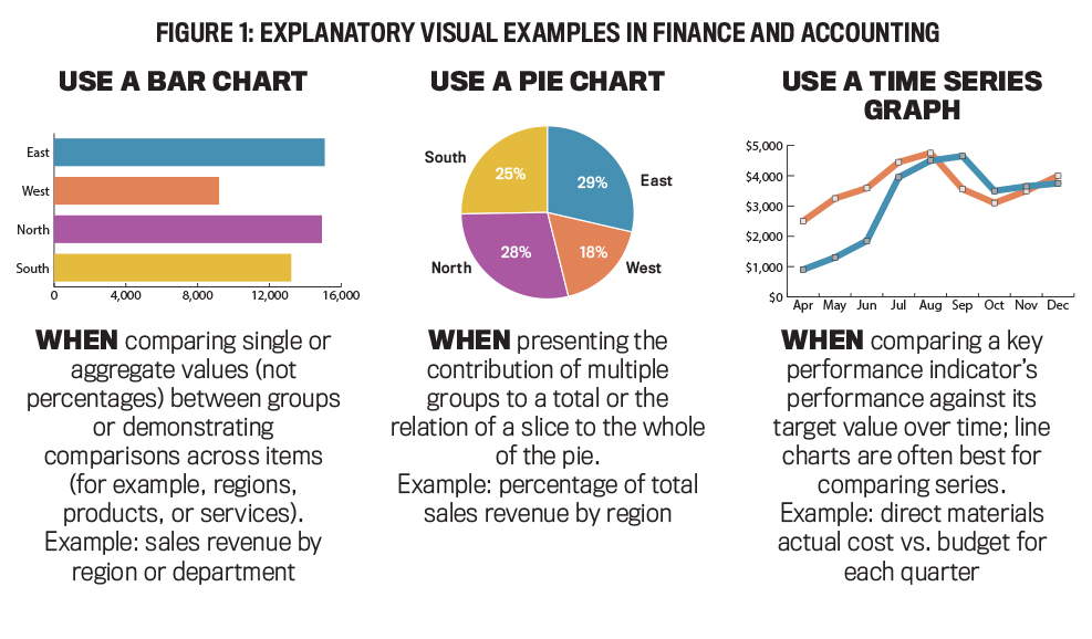
The very nature of our roles and traditional scope of work dictate that some reporting within finance and accounting has a certain cadence: monthly, quarterly, yearly, etc. Manufacturing or supply spend dashboards are examples of cadence reporting. Other reporting is performed on an ad hoc basis and is often prompted by a project or specific business requirement. For example, a company might have recently launched a new product or faced an unexpected change in economic circumstances, sparking an ad hoc analysis request. As data visualization is an extension of, and in some tools, a form of, data analytics, these visual platforms can be connected to source data and refreshed in real time for cadence reporting or updated as needed to ensure data can be sliced and diced, drilled down into, and easily understood. See Figure 1 for a snapshot of data visualization in action in finance and accounting.
 Click to enlarge.
PRACTICAL GUIDANCE FOR TELLING YOUR STORY
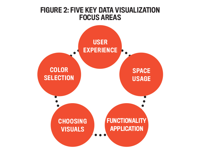
To minimize the audience’s getting “lost in the data,” effective data storytelling requires not only using the right tools but also employing best practices. There are a host of factors that impact the effectiveness of conveying your message. We’ll take a look at five key areas of focus to consider when preparing to tell your story (see Figure 2).
 Click to enlarge.
- User experience: When thinking of data visualization as art, the users are your audience—the people who will be perusing your art. Like an art gallery, the dashboard puts your best visualization pieces on display. The picture you’re painting through the visualization should be intuitive and easy to understand. Key points should stand out from the supporting data, and the main messages—your findings—should be easily identifiable.
To ensure you provide a seamless user experience, (1) include a cover sheet that explains which dashboards are in the workbook, (2) summarize main calculations and data sources, and (3) build in the capability to drill down wherever possible. It’s also important to explicitly state who publishes the dashboard and how frequently the source data is refreshed.
- Space usage: Space in dashboards is incredibly important. A dashboard that’s easy to read and doesn’t cause eyestrain will make users more comfortable navigating it and will improve the likelihood they’ll receive your intended message. Carefully include a concise yet descriptive title, company logo, and some blank space—all of which will suggest you have been intentional about the visualizations included and may subconsciously connect your audience. Blank space will also keep the dashboard from feeling overcrowded and will minimize distractions from the most important insights.
- Functionality application: All leading data visualization tools come equipped with rather extravagant bells and whistles in their functionality suites. In many instances, however, less is more. You want your dashboard to be clean so it’s quick and easy to understand. The more complex the functionality and graphs, the greater the risk of losing your audience, resulting in a diminished ability for users to extract useful information from the dashboard.
- Choosing visuals: The simpler and more relevant the graph or visuals, the more engaging the dashboard or overall presentation will be for your audience. Although there’s a time and place for all graphs, a bar graph with filters will be understood more easily than a complex box and whisker plot that cross-links data. Also, a horizontal bar chart showing discrete values is easier on the eye than a perpendicular bar chart, as humans tend to see horizontal dimensions better.
- Color selection: Colors are very important when painting a picture, and the same is true with visualization dashboards. Many visualization tools have built-in color scheme options from which to choose. Consider utilizing your company’s color palette (ask someone in marketing or public or investor relations for a copy). Always consider selecting colors that will allow users who are color-blind to draw the same insights as others (ensuring enough contrast in shades and using more than color to distinguish points, where possible).
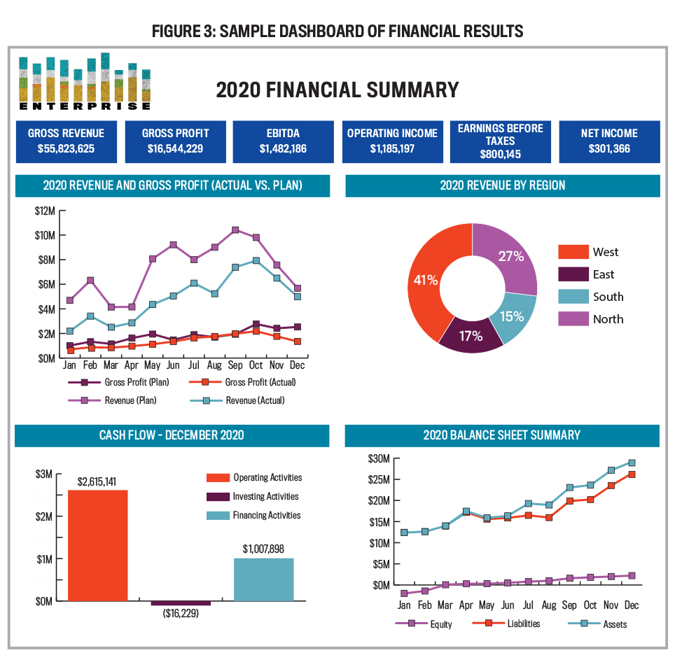
Figure 3 shows some of these tips in action through a sample dashboard displaying financial results.
 Click to enlarge.
UPSKILLING WITH DATA VISUALIZATION
Given the increasing importance of data visualization in the management accounting profession, there are a handful of skills you should look to develop.
Data visualization tools: Familiarize yourself with at least one of the three leading data visualization platforms. Tableau and Microsoft Power BI both offer free versions to work with. Watch a few online tutorials of the leading tools or the one your organization is using (even if it isn’t one of the leading three) and practice using some of the basic visualization skills.
Visualization concepts: Knowledge of data visualization tools isn’t as important as developing the broad skills that equip you with the ability to determine what types of visualizations should be used in specific scenarios to best further your storytelling goal. Focus on becoming familiar with the different types of visuals (a subset of which was covered in Figure 1). Become well-versed in the difference between exploratory and explanatory visualizations. Context and audience will inform which visualization is most appropriate. You’ll find that even if you don’t use data visualization software or create a dashboard, you can still apply these concepts to individual charts or graphs for explanatory purposes in PowerPoint or Excel, so your skills won’t be gained for naught.
Data analytics: The future of our profession will be determined by the extent to which we collectively embrace data analytics. Gaining basic data analytics skills will benefit you well beyond strengthening your ability to lead more in-depth analytics efforts through visualization tools.
From a qualitative perspective, always begin with answering the question posed by the business. Then, as you analyze data to answer that question, work toward identifying the question that truly needs to be answered to deliver the most valuable insight to the business. This may not be the same as the question posed initially. With data visualization, this will be through using exploratory visualization to follow the path the data leads you down. And just as we would with an audit or variance analysis, when the data shows you something interesting, keep digging.
Sometimes this will require going beyond the standard, built-in analytics capability that data visualization tools offer to identify and answer the questions that will garner insights. In these instances, knowledge of a programming language may be required. Tableau uses a language similar to SQL, and Power BI uses the slightly less popular DAX for custom functions and operations.
From a broader perspective, introductory videos on Python, R, or BASIC could help with establishing a baseline understanding in data analytics. The key message: Be purposeful with where you begin. Focus efforts on the direction that will allow you to benefit in the short and long term. For instance, choose what your company uses, if possible, so you can begin incorporating this in your day-to-day work.
Communication: At its core, storytelling is communication. Thus, beyond the technical competencies we’ve discussed, effective communication skills are essential. Simple, clear, concise, and empathetic communication is key to ensuring your audience—CFOs, controllers, or other business leaders—observes the explanatory visualization you prepare and immediately identifies with the insights you derived. This applies not only to individuals simply having access to view your visualizations or dashboard, but also to when you have the chance to present the visuals with narration, such as in a meeting. Work to strengthen your ability to streamline messages. Place yourself in the seat of your audience—multitasking, under pressure, and pressed for time. Ask yourself: What do they really need to know? Then focus your visualizations and presentation on that.
A KEY TO YOUR FUTURE
Technological change is revolutionizing the role of management accountants. No longer are our responsibilities limited to the reporting of financial information and stewardship of an organization’s assets. Increasingly, we’re assuming the role of business partner who helps to formulate, validate, and implement our company’s strategy.
A key to fulfilling this expanded role is having the ability to effectively extract and communicate the information contained in the ever-expanding sources of data—both financial and nonfinancial—now available. Enhancing your data visualization skills now will help ensure you can play a role in the evolution of the profession and prepare you for an exciting, rewarding career.

December 2020


