The key is to use your slides to tell the story effectively without detracting from your message. Piece of cake, right?
Hardly. In many cases, just getting started on a slide deck presents the greatest challenge. For instance, have you ever found yourself staring at a blank screen, wondering where to begin? I have, and it always seems like that blank slide just stares back at me, almost daring me to place the first word or graphic on the empty background.
One obvious starting point is to select a template provided in your presentation software, but certain templates may seem overly familiar to you from other presentations you’ve sat in on and, thus, as stale as month-old bread. If you want your next slide deck to look fresh and grab your audience’s attention, consider moving away from canned templates and creating your own look. It isn’t as difficult as you may think.
With a little thought about backgrounds, colors, fonts, and contrast, you can be well on your way to designing your custom slide deck. Or, if you aren’t comfortable creating a customized template or your organization has its own standard template, you can still apply these design elements to give your presentation a solid visual approach that will help convey your message effectively.
CHOOSE A BACKGROUND
One of the first decisions in designing effective slides, especially those that present intricate concepts or data visualizations, is selecting the background color. While you may be tempted to think it’s as simple as choosing white or black or a standard Microsoft PowerPoint template, there are four basic considerations when making that choice: room lighting, graphics, slide size, and template background.
First, if possible, check out the room where you’ll be presenting. Is there a lot of ambient light? Will the lights be on, off, or dimmed? The amount of light should influence your choice of backgrounds. In a dark or dimly lit room, a white or light-colored background will be too bright for the audience. In this case, a black or dark-colored background will be a better choice. If you’ll be in a brightly lit room, however, using a white or light-colored background will work just fine.
Next, consider the type of graphical elements you’ll be using in your slides. If your graphics have a white background, think about using a white background for your slides. As you can see in Figure 1, this allows the graphic’s background to blend in with the slide background, letting the image “float” and giving your slides a more professional look. Using the black background in this case causes the eye to focus on the graphic’s background rather than the graphic itself.
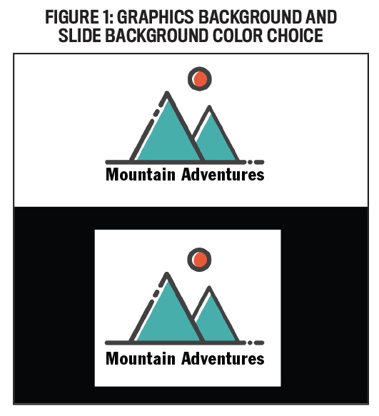
If your graphics have a white background and you want to use a black background, there are a couple of ways around this. First, you can remove the white background from the graphics by using the “remove background” feature in PowerPoint or using photo-editing software such as Adobe Photoshop. Be aware that photo-editing software will do a much better job of removing the background than PowerPoint alone.
Another option is to use transparent graphics (often identified by a PNG extension), which have the white background from the image removed. As shown in Figure 2, these graphics will often show up with a gray-and-white checkerboard pattern when you preview them in a graphics selection program.
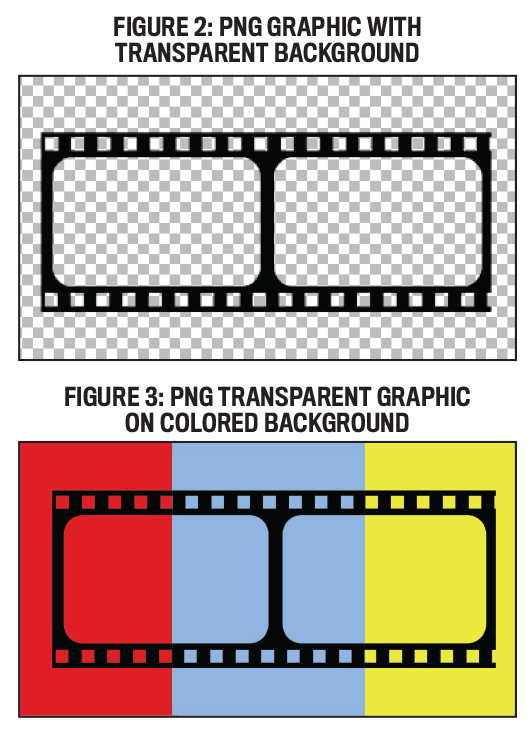
If you’re using Google to find graphics, you can filter your search to include only images with transparent backgrounds by selecting “Images,” clicking on the “Tools” button below the search area, and using the “Color” tool to specify “Transparent” as the color. As shown in Figure 3, transparent graphics work well on any color slide background.
A third consideration affecting background color choice is the slide size. Figure 4 shows the same standard size slide (4:3 aspect ratio) with a white background and with a black background. As you can see with the slide on the left, using a white background creates vertical black bars on either side of the projection screen. If you use a black background, however, these areas appear to merge into the background, in effect creating a larger slide footprint. Of course, you can avoid this issue by using a widescreen format (16:9 aspect ratio) for your slides, in which case a white background on a widescreen slide will fill the projection screen.

Finally, whether you choose to use a stock template provided in your presentation software or design your own template, the background graphics shouldn’t distract from your message graphics. And since you don’t want any of your slide elements to overlap the background graphics, a template with large graphical elements will reduce the area available for slide content.
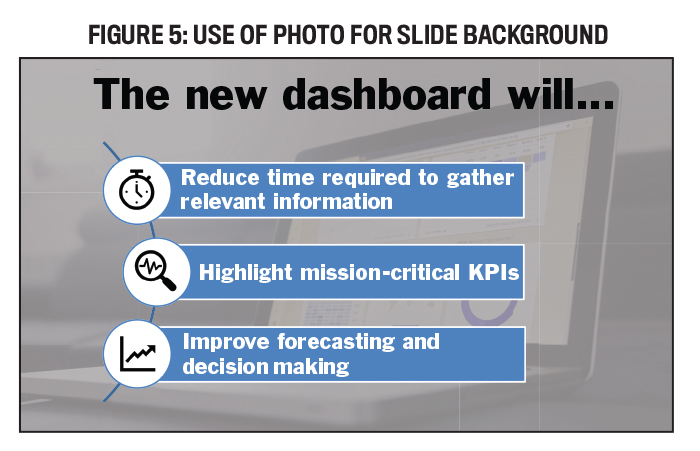
One way to add interest to your slide deck is to use a photograph for your background, as shown in Figure 5. If you choose this design route, you may use the same image for all of your slides or use different photos for each slide. Either way, choose high-quality photographs that complement your presentation content and won’t distract your audience’s attention from the slide’s main message. If you choose multiple photographs, select ones that have a similar look and feel to provide consistency within your presentation. You may find that you need to recolor the pictures to match your overall color scheme or to provide adequate contrast with the text.
A final word on photos: Beware of copyright issues! Websites that offer free images include pexels.com, pixabay.com, and unsplash.com. There are plenty of eye-catching images to choose from on any of these sites without the hassle of asking permission or paying a fee.
DEFINE A COLOR PALETTE
Choosing a color palette at the beginning of the design process will help ensure your slides have a consistent look and feel throughout the deck. Many times, part or all of this color scheme may be dictated by your employer, so talk with your manager or human resources department before you get started. If you have some freedom of choice, Adobe Color is a handy tool to help with the color selection process.
While most of us use words to define colors, my idea of “navy blue” might be different from yours. To eliminate this ambiguity, using one of the three primary systems for defining colors—Pantone PMS, RGB, and CMYK—will help you define a color palette for your slides, particularly if you’re trying to match an organization’s “official” colors. In the absence of official color definitions, you can get close by pasting a logo in a blank PowerPoint slide and using the eyedropper tool to capture the desired color definitions.
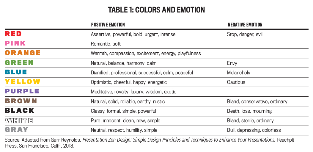
When selecting colors to include in your color palette, you need to think about the emotions attached to certain colors. In his book, Presentation Zen Design: Simple Design Principles and Techniques to Enhance Your Presentations, communications expert Garr Reynolds offers insights into colors and the emotions they evoke. For instance, red can suggest feelings of assertiveness, boldness, danger, and urgency, while blue is seen as dignified, professional, calming, and melancholy. Green can be viewed as calm and balanced but also evokes feelings of envy. Table 1 presents 11 colors and the emotions Reynolds links to them.
 Click to enlarge.
Since you’ll likely use more than one color in your slides, a color wheel can help you select combinations that work well together. Figure 6 illustrates six basic color schemes to consider for your color palette.
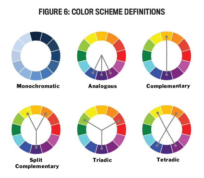
When selecting a color scheme for your slides, you shouldn’t use more than four different colors. Choose one as the dominant color, one as a support color, and the remaining colors as accents. While each of the color wheels in Figure 6 shows only 12 colors, online tools such as Adobe Color provide a full spectrum of colors, shades, and tints to choose from.
Monochromatic color schemes are based on a single color and use tints (lighter colors created by adding white), shades (darker colors created by adding black), and tones (colors created by adding gray) of that color for accents. A closely related scheme not illustrated in the figure is an achromatic scheme, which uses black, white, and gray combined with one brighter accent color.
An analogous color scheme uses three colors that are side by side on the color wheel. These schemes are generally thought to be serene and comforting, but you should avoid having both warm and cool colors in a single analogous color scheme. Black, white, and gray can provide additional accent colors.
Complementary color schemes use two colors that are opposite each other on the color wheel. This scheme is vibrant, but a complementary color combination for background and text doesn’t work well. Instead of choosing a color directly across the color wheel, a split complementary scheme chooses the two colors on either side of that complementary color. This scheme provides much of the same vibrancy and contrast as the complementary scheme, but it lacks some of the harshness found in some complementary selections. Other options include a triadic scheme, which employs three colors that are evenly spaced on the color wheel, and a tetradic scheme, which uses four colors (two sets of complementary colors).
Once you’ve selected your color palette, choose the text color carefully so that it provides enough contrast against your background color. For instance, black text on a dark blue background or light gray text on a white background won’t provide enough contrast to make the slide text easy to read.
SELECT A FONT
If your computer is like mine, there are so many fonts installed that choosing one can be overwhelming. While fancy fonts have their place in good design, a business slide deck usually isn’t one of those places. When choosing your font, remember that the person sitting in the last row has to be able to read what’s on your slide, and fancy fonts will be harder to read.
Limit yourself to one or two fonts (three at the most) for your slides. While this may seem restrictive, you can use a combination of two or three different sizes, weights (regular, bold, condensed), and italics of the same font to establish variety while still ensuring a consistent feel to your slides. If you do choose to use multiple font families, be sure that they’re different enough—Arial vs. Times New Roman, for instance—so it doesn’t look like a mistake.
When choosing a font, consider the computer that will be running your presentation. If the font you use to create your slides isn’t loaded on the computer used to present the slides, you can run into trouble. While the program will substitute a font that it believes is “close” to the specified font, this can sometimes result in misplaced or unreadable text. To avoid these font issues, it’s best to stick with a few standard fonts that are most likely installed on any computer. Table 2 lists some standard fonts that are commonly installed on most computers.
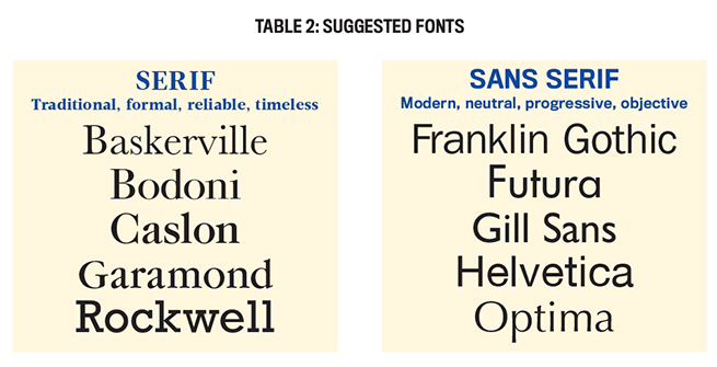
Notice that they’re grouped into serif and sans serif fonts. Serifs are the small “tails” at the ends of letters (for example, compare the “i” of Baskerville and Helvetica). Serif fonts work best on a slide when the font is large; otherwise, the serifs can run together, making the text more difficult to read. Sans serif fonts work well at all sizes. Note, too, that some fonts appear larger than others even if the same point size is used.
USE CONTRAST EFFECTIVELY
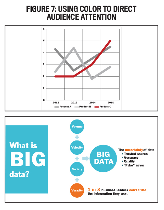
When creating a presentation slide, you want to control how the audience views the information. A simple way to direct the viewing is by using contrast to draw the audience’s eyes to the desired part of the slide. For instance, you may want everyone to focus on the content that you happen to be speaking about at a particular time, or you may want them to focus on the most important part of the content on a single slide. Three ways to direct the audience’s attention are color, size, and movement.
Color is an easy way to direct attention to a specific area of a slide. Notice in Figure 7 that this technique can effectively call attention to a specific component of a graph; bring focus to newly added components on a “building” slide, where elements appear one at a time; or connect important parts of the slide.
Because size is often associated with importance—the larger the item, the more important it’s assumed to be—it can be used to direct the audience’s attention to specific items. As shown in Figure 8, size can be used effectively for both text and graphics. It can also be combined effectively with color and contrast to draw attention.
 Finally, use movement to direct your audience’s attention to specific items. In Figure 9, for example, you can animate or “build” the appearance of individual parts of a graphic, bringing in each of the four items in the slide on the right (Data, Information, etc.) individually as they’re discussed, instead of displaying the entire graphic at once. And if you have to use a bulleted list, animate each item to appear as you discuss that particular point so that your audience doesn’t read everything on the slide quickly and get too far ahead of you.
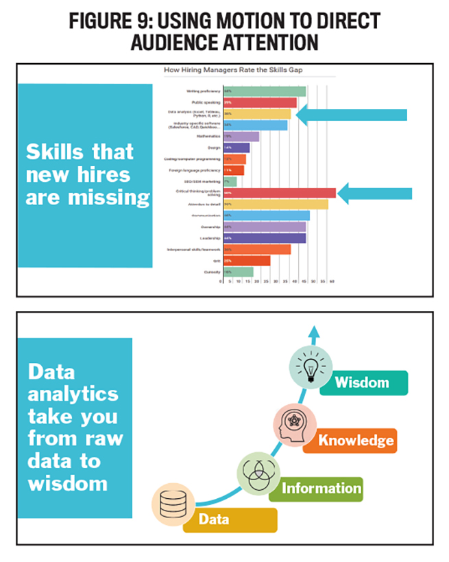
While programs such as PowerPoint give you multiple options for movement, overuse of movement will actually reduce its effectiveness. In Figure 9, for example, it’s best to use simple movements, such as using a “wipe” to display the arrows in the first slide and a “fade” to bring in the four parts of the graphic in the second slide. Avoid the fancy spins and boomerangs that may leave your audience feeling a bit dizzy.
NEXT STEPS
If you’re thinking that all of this sounds like a lot to consider when designing slides, you’re correct. Besides the mechanics of slide design, just like good writing, good slide design requires multiple drafts, proofreading, and editing. In her book slide:ology: The Art and Science of Creating Great Presentations, communications expert Nancy Duarte estimates it takes roughly 20 to 60 hours to build 30 slides to support a one-hour presentation, with the total development time for a presentation ranging between 36 and 90 hours.
While templates can help reduce this development time, many of them feel overly familiar—death by PowerPoint, if you will. If you choose to use a standard template, change the colors and fonts to freshen it up. But designing your own slides—possibly with the help of a local graphic artist, college art student, or someone in your company’s marketing department—will make your presentation really stand out from the crowd.
A good way to start developing your own design skills is to look critically at other people’s slides and jot down what you find interesting and effective about them; then use these elements to begin building your own bag of tricks. And do some additional reading (see “Slide Design Resources” below) to learn more about slide design from experts on the subject.
You now have some good tips and tools to improve your slide decks. As a creative exercise, call up an old deck and apply what you’ve learned about backgrounds, colors, fonts, and contrast. See if you can add some interest and impact to those slides. And when you’re done, ask a colleague to compare the old and new decks and give you some honest feedback. I think you’ll be surprised with the results, which you can use to make your next presentation really shine.
SLIDE DESIGN RESOURCES
Over the years, I’ve found plenty of helpful guides to creating more interesting presentations, both online and in book form. Here are some that are particularly valuable.
ONLINE
- Presentation Zen, presentationzen.com
- SlideShare, slideshare.net
- Note & Point, noteandpoint.com
- Improve Presentation: The 22 Best PowerPoint Templates for 2020, improvepresentation.com/blog/best-powerpoint-templates
- Slidedocs, duarte.com/slidedocs
- Presentation Process, presentation-process.com
BOOKS
- Nancy Duarte, slide:ology: The Art and Science of Creating Great Presentations, O’Reilly Media, Sebastopol, Calif., 2008.
- Nancy Duarte, HBR Guide to Persuasive Presentations, Harvard Business Review Press, Boston, Mass., 2012.
- Garr Reynolds, Presentation Zen: Simple Ideas on Presentation Design and Delivery, Peachpit Press, San Francisco, Calif., 2019.
- Garr Reynolds, Presentation Zen Design: Simple Design Principles and Techniques to Enhance Your Presentations, Peachpit Press, San Francisco, Calif., 2013.
- Robin Williams, The Non-Designer’s Design Book: Design and Typographic Principles for the Visual Novice, Peachpit Press, San Francisco, Calif., 2014.

May 2020


