When trying to present a lot of vital information, one of the easiest mistakes to make is to create slides that are nothing but bullet points and large blocks of text. Your slides shouldn’t read like a transcript of your presentation. If they do, you can cancel the face-to-face meeting and simply send the presentation deck to the expected attendees so they can read the slides at their convenience and get all the content they need.
Your slides should be a visual aid to your presentation—with heavy emphasis on visual. People can process visuals faster than they can process text, so your audience will be better able to concentrate on understanding what you’re saying when they aren’t reading along with (or, more likely, ahead of) you as you speak. Here are 10 tips to help you move away from text-heavy slides and harness the power of the visual aid to tell your story and give a more impactful, informative presentation.
1. PRESENT ONE IDEA PER SLIDE.
There are a number of rules of thumb that people use for determining how many slides should be used in a presentation of a given length, such as “No more than one slide per minute” or “10 slides for a 20-minute presentation using 30-point font.” Forget these and any other rules you may have heard.
Slides are free, so don’t worry about the number of slides in the presentation deck. What you need to concentrate on is preparing effective slides that contain only one idea. You won’t save any presenting time by cramming three ideas on a single slide rather than doing one separate slide for each idea. But while your slide count will increase, it’s likely that your effectiveness in communicating those ideas will also increase because your audience will be focused on the one, single idea rather than juggling three different ideas at a time.
2. CHANGE BULLETED LISTS TO GRAPHICAL ELEMENTS.
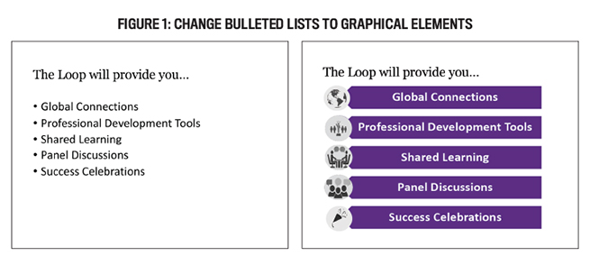
You’ve probably heard that a slide should have no more than six bullet points with no more than six words on each point. The problem with those slides is that your audience will be reading your slides while you’re talking, and they can’t concentrate on what you’re saying if they’re reading. They also will read faster than you can talk, so they will have to sit and wait while you finish saying what they have already read.
Consider converting the text to a graphical format as shown in Figure 1. PowerPoint Smart Art provides several options for changing bulleted lists to graphical displays. Notice that the slide on the right contains the same words as the bulleted list, but it’s much more visually appealing. To prevent your audience from reading ahead, add an animation to the slide so that each point appears as you begin talking about it, helping your audience focus only on that particular point.
3. CHANGE BULLETED LISTS TO MEANINGFUL PICTURES.
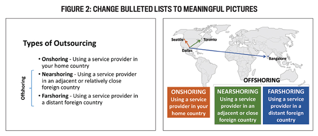
It has long been said that a picture is worth a thousand words, so convert your bulleted lists to pictures. In Figure 2, adding the image of the map brings the words to life. You can also add slide animations so that each text box and the related color-coded arrow appears on the map as you discuss that specific option. The picture helps the audience understand the concept much faster than just printed or spoken words. Since research shows that people remember pictures better than words, following this tip also should help your audience remember your content after the presentation. Being able to use pictures to help tell your story or present your argument in this manner is quickly becoming a particularly important skill for accounting and finance professionals, who are increasingly being expected to use visualizations in the era of Big Data.
4. USE AN ORIGINAL SLIDE TEMPLATE.
It’s easy to open PowerPoint and select a stock template. But after a while, everyone recognizes the template and it can start to feel “old’ or “tired.” You can capture your audience’s attention by designing a custom template. It doesn’t have to be fancy—just something different. Another option is to consult with your company’s marketing and branding department to see if there’s a corporate-specific template available.
Consider the title slides in Figure 3. The slide on the left is a generic template. It does nothing to generate interest and grab the audience. The slide on the right, however, is a custom template based on the topic of the presentation. The bat, ball, glove, and grass picture can be repeated at the bottom of each slide, or you could find a related picture or graphical elements to use on the content slides.
5. MODIFY DEFAULT GRAPH FORMATS.
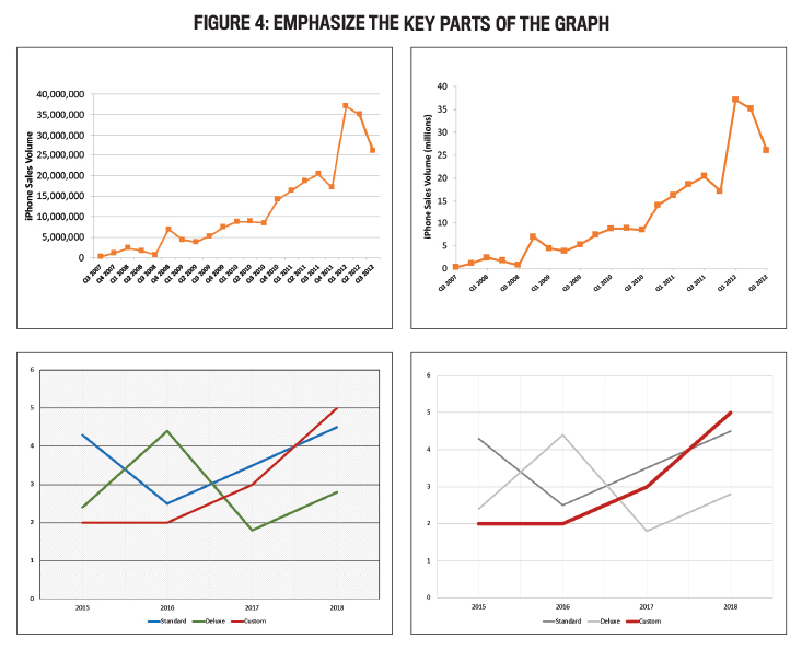
For those of us in the accounting and finance realm, charts and figures will likely be major components of our presentations. With a few mouse clicks, you can generate nice graphs in programs like Microsoft Excel. While they’re helpful in displaying data, using them effectively in a presentation will require some adjustments to the standard output. Identify the most important information in the graph and make it stand out in some way.
Consider the first set of slides in Figure 4. Audience members aren’t going to sit at a presentation and try to read all the data points on the line chart in the left-hand slide. (And if they try, that means they won’t be paying attention to you speaking.) Now look at the slide on the right. Unnecessary grid lines were removed, other lines were lightened, and the data labels were reformatted. The result is much easier to read.
In the second set of slides, the chart is being included to highlight the performance of the Custom line. Notice how your eye is drawn immediately to the relevant line in the right-hand slide. All it took was increasing the size of the line and adjusting the colors of the chart.
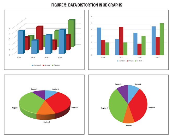
Also avoid the temptation to use 3D-style charts. They present a distorted view of the data. Consider the 3D bar chart at the left of Figure 5. It’s almost impossible to determine the correct height of the bars. Should you look at the front or the back of the bar to determine the height? And look at the Standard bar for 2014. In the 3D chart, the value appears to be less than 4. When you convert it to a 2D chart, however, the value is clearly greater than 4.
Pie charts have the same issue. In the second set of graphs in Figure 5, Regions 1, 3, and 5 are all the same value (10%). In the 3D pie chart, however, Region 3 looks quite a bit larger than 1 and 5.
6. USE PICTURES AS YOUR BACKGROUND.
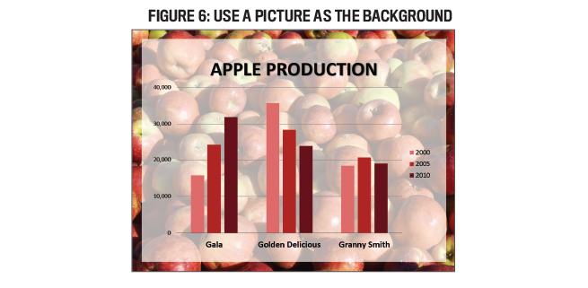
Let’s face it, while a plain white background may be appropriate in some circumstances, the result looks very plain. Consider using an image as your slide background instead. When using a picture, however, you need to make sure there is enough contrast between the background and the information presented on the slide. Make sure the text is still readable and will stand out. This might require adding a semi-transparent shape behind the text to increase the contrast while still letting the picture show through, as shown in Figure 6.
While it may be tempting to use the first picture that appears in a Google search, you must be aware of copyright issues. Look for pictures that are shared under a Creative Commons license (www.creativecommons.org) or that are in the public domain. And as with any work, provide appropriate citations when required.
7. USE WHITE SPACE TO IMPROVE READABILITY.
White space, also called negative space, is the space between the various elements on your slide, including the slide margins. Notice the little bits of space added between the bars in Figure 6. Adding that extra bit of white space makes the chart appear less crowded and more readable.
8. RESIZE, CROP, AND RECOLOR PICTURES.
When looking for a picture to use on a slide, most of us choose one without giving its composition a second thought. Even though the photographer took it a certain way, that doesn’t mean we have to use it that way. Sometimes the picture becomes more effective after it’s resized and cropped. Notice in Figure 7 how the original picture on the left, which puts the whale in the center of the slide and doesn’t fill the slide, has been enlarged to cover the slide and then repositioned and cropped. The result is a background picture that provides more visual interest, greater focus on the whale as the picture’s subject, and more space in the upper-left to add text.
One trick to help maintain a consistent feel within a slide deck is to recolor the pictures to a single color palate. In Figure 8, PowerPoint's Colortool was used to match a color palette by adding a green tint to a full-color picture. Other recoloring options include adjusting the color saturation and color tone to alter the color vibrancy.
9. APPLY THE RULE OF THIRDS.
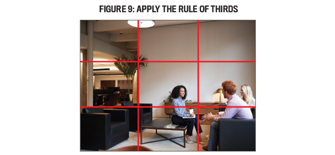
First articulated by John Thomas Smith in 1797, the rule of thirds is a guideline used by painters, photographers, and cinematographers to frame a visual image in a way to generate compositional energy and interest. Basically, this rule divides the design canvas into thirds, both horizontally and vertically. Rather than positioning the important visual elements in the center of the canvas, these elements are placed on or near one of the “third” lines or at their intersections. Notice in Figure 9 how the people are in the lower-right-hand side of the frame rather than centered in the photo. This makes it more dynamic than if the people were right in the center. If a picture you want to use doesn't follow this rule, resize it and position it on your slide so that it does. The two slides in Figure 7 are an example of using this trick to make a picture more visually appealing.
As you adjust the image to make it more effective—whether you’re cropping or resizing it, changing its colors, or applying the rule of thirds—remember to keep in mind how the text and other elements will appear on top of the image. You don’t want the photo to draw attention away from the ideas you’re presenting or make it too difficult for the audience to read.
10. ELIMINATE UNNECESSARY TEXT.
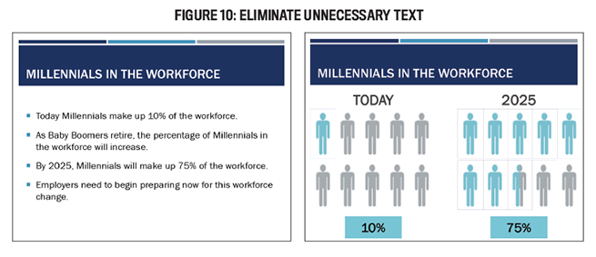
Most of us have a tendency to put too many words on a slide. Perhaps it’s because we think that having the words on the slide will help our audience remember what we’re saying. But research actually shows that people will remember more of what we say in a presentation when the words aren’t on the slide. Removing the words also will eliminate the temptation to read the slide to the audience.
In the set of slides presented in Figure 10, much of the initial text has been eliminated to create a simple pictorial slide. The eliminated text will be shared with the audience through the spoken presentation. If you believe it’s necessary to provide the extra words or a transcript of the presentation to the audience, prepare a handout to distribute at the end of the presentation.
LEARNING BY EXAMPLE
Applying these 10 tips will get you started in creating more visually engaging presentations, but don’t stop there. Presenting information is a critical skill for accounting and finance professionals, so you always need to be on the lookout for ways to improve. A good way to begin to master a more visual slide design approach is to look at what others are doing. When you see an effective slide design that speaks to you, file it away for later use. Think of it as curating your own “Pinterest” board of good slide designs.
To get started, I recommend that you check out three books that have helped me make the switch to more visual slide design. Garr Reynolds, a pioneer in this movement, has written two books that provide many examples of redesign efforts: Presentation Zen: Simple Ideas on Presentation Design and Delivery and Presentation Zen DESIGN: Simple Design Principles and Techniques to Enhance Your Presentations. Nancy Duarte, founder of leading presentation development company Duarte, Inc., details her approach in slide:ology: The Art and Science of Creating Great Presentations.
It may take a little more time and creativity to implement these tips, but with practice they will become second nature. Then your audience will thank you for saving them from “death by PowerPoint.”

May 2019

