For illustrative purposes, consider an organization (we’ll call it ABC Organization) with an internal service center tasked with supplying paper to various departments. Suppose that the internal service center intends to bill the other departments for their paper consumption and therefore needs to report types and quantities of paper by consumer.
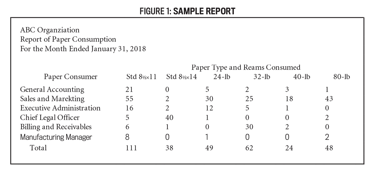
Figure 1 provides a sample report for this purpose, generated using Microsoft Excel. This report has a variety of design issues, perhaps representing a first draft that might be prepared. Before you continue reading, it may be insightful to take a few minutes to closely examine this sample report and try to identify necessary changes. Determining that this report has design problems is a critical step (and may not be particularly difficult), but understanding the specific nature of the reporting problems and how to correct them is key to producing higher-quality reports later.
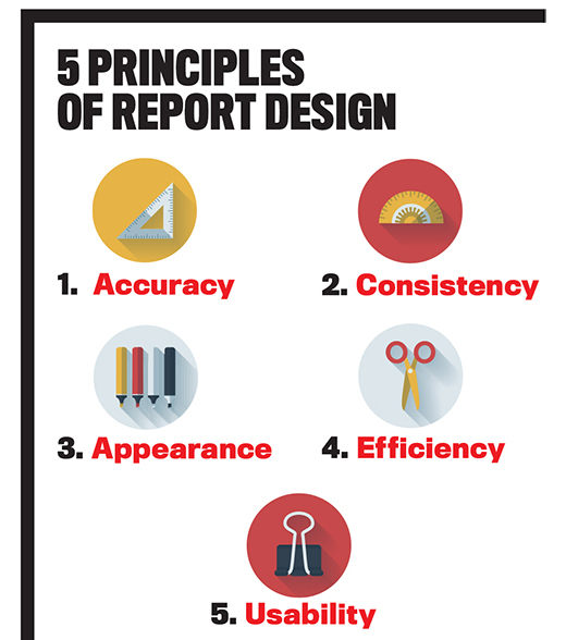
It’s important when reviewing reports to allow some flexibility in presentation as long as the end result is still appropriately professional. In my experience, individuals often develop their own reporting style (such as selecting particular fonts and other reporting attributes that they favor); my primary emphasis is in encouraging the use of a consistent and professional reporting style compliant with these five principles. Evaluation of these principles is likely to be more beneficial for reports that are prepared manually, but they’re also worthy of consideration related to system-generated reports that can be negatively affected by the setup and maintenance of system components (the so-called “garbage in, garbage out” scenario).
1. ACCURACY
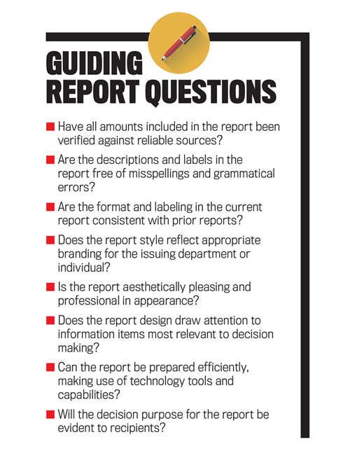
The accuracy principle simply means that the content of a report represents what it claims it does. It involves, for example, ensuring that the written components and titles in the report are free from spelling and grammatical errors and that the data presented is associated with the time period(s) indicated. It should also require that the titles and descriptions in the report are consistent with the actual amounts included in the report.
For example, an amount reported as wages expense on a report should, in fact, be the amount of wages expense for the period and not some other expense. And, of course, any amounts included in the report need to be accurate, even if amounts (particularly in accounting) sometimes require judgment and estimation. When the true amounts may not be known for certain until some future date, as is common with accounting data, the estimated amounts should at least be verifiable against standard data sources to be considered accurate.
In my professional experience, reports often included nonfinancial data such as employee full-time equivalents (FTEs), inventory quantities, and even pairs of safety shoes. As financial systems don’t always track such measures, utilizing established scales to convert financial data and to reasonably estimate nonfinancial measures is sometimes necessary. Further, I learned to be particularly cautious when reports include any labels that are presented in all caps because such labels usually are excluded from spell-checking functions.
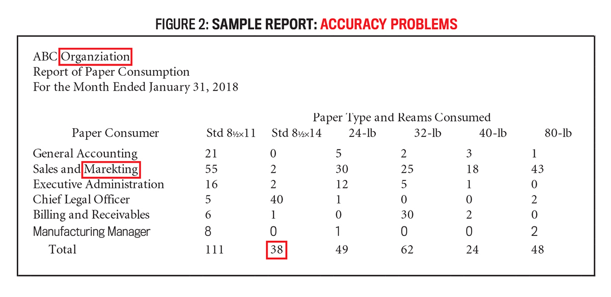
The sample report is lacking in accuracy in at least three regards. First, both the title (“Organziation”) and one consumer name (“Marekting”) have spelling errors. Misspellings can occur when reports are prepared in a hurry and involve manual data entry. The misspellings can usually be easily detected and corrected by using the spell-checking function available in most software packages, including Microsoft Excel, though these tools aren’t always sufficient. All reports should be proofread carefully. Also, the total for “Std 81/2×14” of 38 reams is clearly incorrect, as the chief legal officer alone consumed 40 reams. These accuracy problems are noted in Figure 2. Other accuracy issues, such as specific amounts not corresponding to the label or period indicated, could be less immediately apparent. The process for determining the paper quantities for each consumer also could need to be validated.
2. CONSISTENCY
The consistency principle requires that the format and layout of a report are similar to prior issuances of the same report and/or other reports issued by the same department. In many organizations, selected individuals or departments (such as the CFO or the board of directors) will receive many different reports each period. Depending on how well such a recipient organizes reports, whether electronic or in paper form, having a consistent (and, in certain cases, distinctive) format or “feel” for each report or for each issuing department will allow the recipient to quickly identify a needed report for a specific related decision. Having a consistent format can also provide a brand style for the source department or individual preparer.
In my own reporting, for example, I developed a preference for using the Garamond font in the title bar (also centered and bolded) and the Book Antiqua font in the body of my reports. Consistency also involves ensuring that titles and descriptions remain the same from one period to the next so that recipients know that the same information is being reported. (To the contrary, changing a column or row label, even slightly, could lead a recipient to question whether something different is now being reported.) Fonts and other format attributes also should be consistent to be in compliance with the principle.
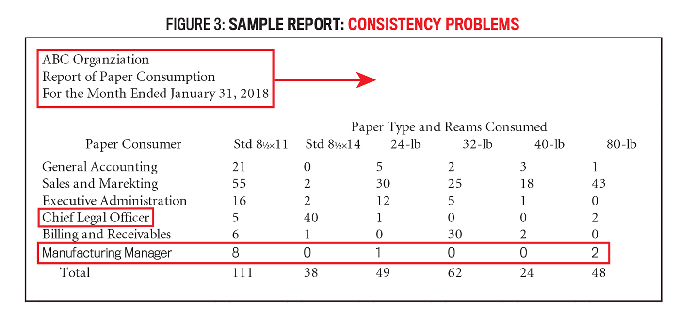
A number of consistency issues exist in the sample report. For one, although reporting styles will vary, the title for this report isn’t consistent with what most people would use. More often, the title would be centered and would perhaps involve bolded or other emphasized text. The sample report also includes some inconsistent consumer descriptors. Most of the noted consumers represent groups or departments, but two of them (Chief Legal Officer and Manufacturing Manager) represent individuals. This is an example of a reporting issue that could result from inconsistent structure within the accounting system.
Last, although I find that many students in particular have difficulty noticing such a problem, one row in the report (for the Manufacturing Manager) is presented using a different font. This particular problem often arises when an additional row must be added to a pre-existing report. Figure 3 highlights the consistency issues associated with the sample report.
3. APPEARANCE
The appearance principle means that the report is aesthetically pleasing and also professional-looking. (After all, this is similar to but not quite the same as creating artwork.) Aesthetically pleasing reports should include proper alignments and should make appropriate use of white space, borders, shading, and color. The purpose of most reports is to support decision making, and improving the appearance of the report can often help to draw the attention of the decision maker to the most relevant data items (and can avoid distracting the recipient).
For example, inserting a blank row above and/or underlining a very important financial statement amount naturally attracts the gaze of the reader. I’m an admitted direct communicator, being very specific when I provide positive or negative feedback to report preparers (and now students). During my professional career, I became notorious for occasionally remarking “this report hurts my eyes” when I was particularly frustrated with the design of a draft report that I was reviewing. In short, the appearance principle is intended to not “hurt the eyes” of report recipients.
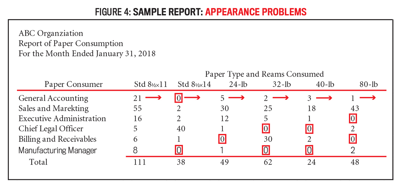
The sample report is lacking in various appearance attributes. The report includes no lines or bolding that would help draw the attention of recipients to important data. It wouldn’t be uncommon, for example, to include lines beneath the column headers and above the column totals so that the titles and totals appear separated from the central content of the report. Additional white space, borders, shading, and color could be applied in this sample report to better direct attention and to support decision making. Also related to appearance, amounts included in reports should be right-aligned rather than left-aligned. Use of the “accounting” cell format in Microsoft Excel will replace the zeros with dashes, which often results in a more pleasing report appearance. The needed corrections to the sample report related to appearance are shown in Figure 4.
4. EFFICIENCY
The efficiency principle involves ensuring that a standard report can be prepared as quickly and easily as possible. This often means utilizing automated or formulaic fields where possible. This will help to minimize the data entry and computations necessary for the preparation of reports. If possible, building reports to extract data directly from the underlying accounting system, both for labels and amounts, can create the greatest efficiency. In one of my prior professional positions, where a legacy, homegrown accounting system with poor reporting capabilities was used, we created higher-quality reports with many automated fields using Microsoft Access. The reports then extracted data from SQL tables that were created in a nightly download from the accounting system.
In one case, that allowed us to essentially automate about two-thirds of the organization’s annual reporting, which had previously been prepared by continuously updating numerous large Excel files (a process that was slow, labor-intensive, and ripe for errors). And efficiency should relate not only to the preparation of reports but also to the use of reports where helping to ensure that relevant decisions are supported efficiently is important.
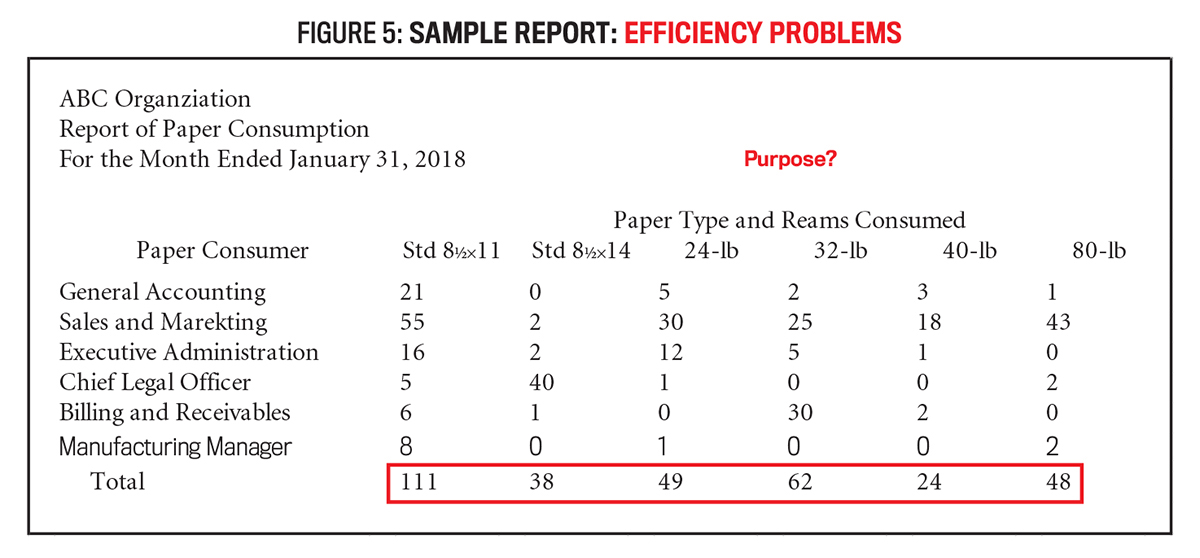
Again, the sample report reveals a variety of efficiency problems. First, because it was observed earlier that the total for the legal stock was incorrect, it would seem that formulas aren’t being used for the total row of the report. Microsoft Excel offers a variety of powerful formulas and functions that can improve reporting efficiency, the most basic of which is to include a summing formula in the total row. (More complicated formulas, lookups, and pivot functions can add tremendous efficiency for reports generated using Microsoft Excel.)
Related to efficiency of use, it isn’t at all clear in the sample report what decision process it’s intended to support. Inclusion of some additional information related to the totals might make the report more efficient to use. For example, it was noted earlier that the purpose of the report was for the internal service center to request reimbursement for the paper provided to each consumer group. That purpose could be better demonstrated in the report itself to avoid recipients making either no use or inefficient use of the report. Figure 5 illustrates the efficiency issues described for this sample report.
5. USABILITY
The usability principle relates very specifically to decision support for the report recipients. It involves considering how the report will be disseminated. In that regard, report data should be organized to allow for easy extraction by recipients. It should also be easily understandable given the specific background(s) of the recipients. My professional experience included working for a scientific organization, a manufacturing organization, and a healthcare/education organization. Each of those industries involved specialized vernacular that may not have been understandable to the general public. As such, it was always important that I considered the backgrounds of the specific recipient(s) for each report that I was preparing or reviewing and ensured that the format and terminology would be understandable.
Reports should also be formatted for duplication, where appropriate, or for posting to websites (to be accessible using a variety of electronic devices and a variety of internet browsers). For example, whereas use of shading and color may be deemed worthwhile to improve the appearance of a report, it might make the report less suited for duplication.
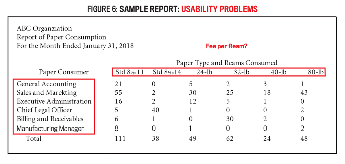
The sample report is again lacking in terms of usability. It was noted earlier that the report was intended to request reimbursement for paper supplied by the service center, and including a column for the amount requested would serve that purpose. But the report would be more usable if it also somehow indicated the basis for determining the amount requested from each consumer department, perhaps by indicating the fee or reimbursement rate per ream of each type of paper.
Rearranging the order of the rows to be alphabetical might also allow each recipient to more quickly identify the amount owed by his or her department. The report might be considered more usable or understandable if the column labels were changed to reflect common descriptions for the types of paper rather than paper weights and sizes and to include some notation of the quantity included in a ream of each type of paper (which often varies). The usability concerns for the sample report are noted in Figure 6.
THE SOLUTION
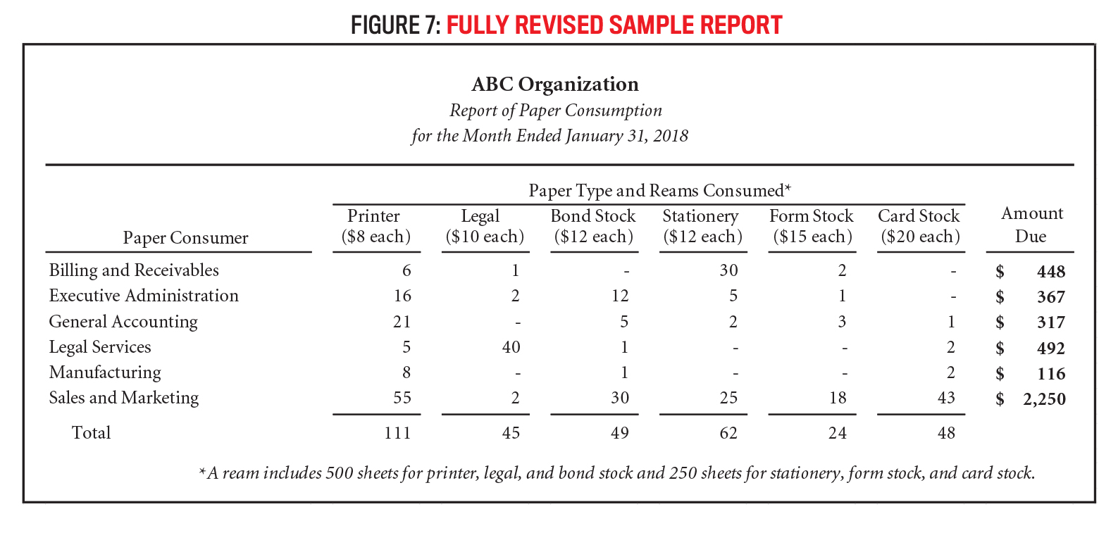
While reporting style preferences will vary and reports won’t always be perfect, greater attention to these principles should allow accounting professionals and students alike to improve the quality of reporting. In addressing the problems related to the five principles, the revised sample report presented in Figure 7 is substantially improved.
The specific style of this revised report may not align with the preferences of other preparers, but the generalities of the five principles of report design should be universal. Reporting quality improves when preparers give proper consideration to accuracy, consistency, appearance, efficiency, and usability, and this article should serve as a useful guide, particularly for students and young professionals developing their reporting skills.

April 2018

