2016 DATA
Make a query to show to show the new 2016 data. Copy the q_Sales_by_Month_2015_cht query and change its name to “q_Sales_by_Month_2016_cht.” Change the name of the Sale15 field alias to Sale16. Change criteria for year to 2016. Delete the YrMo calculated field since it isn’t being used. Save and close. The SQL statement for the new query is:
SELECT Format([dtSale],”mmm”) AS Month
, Sum(ProdSales.Amount) AS Sale16
, CInt(Month([dtSale])) AS Mo
FROM ProdSales
WHERE (((Year([dtSale]))=2016))
GROUP BY Format([dtSale],”mmm”)
, CInt(Month([dtSale]))
ORDER BY CInt(Month([dtSale]));
ADD 2016 DATA TO THE CHART
Copy the qCht_Compare_2015_2014 query and change its name to “qCht_MonthSalesByYr_Growth.” In Design view, drag q_Sales_by_Month_2016_cht from the Navigation Pane to the upper pane of the new query. If the property sheet isn’t displayed, turn it on by pressing Alt+Enter or by right-clicking and choosing Properties from the shortcut menu.
Click on the query for 2014. In the property sheet, notice the alias is q2014 instead of the long query name (which you can see in the SQL statement). Click on the query that was just added for 2016. Change the Alias for the new field list (in the property sheet) to q2016.
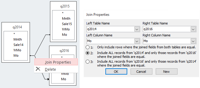
Drag a relationship from Mo in q2014 to in q2016. When you look at the Datasheet view, however, months have been limited to February since that’s as far as the 2016 data goes. That’s because the default behavior for joining is to show records that only exist in both record sources.
In Design view, right-click on the link line between q2014 and q2016. Choose Join Properties from the shortcut menu, and change the join type to “Include ALL records from ‘q2014’ and only those records from ‘q2016’ where the joined fields are equal.” The link line will be labeled with an arrow pointing to the less important table (see Figure 1.)

Add Sale16 to the grid and give it an alias of “Sales 2016” by entering Sales 2016: Sale16 in a new field.
CALCULATE GROWTH RATE
Now that we have the monthly data, what if we wanted to calculate the growth rate for each month of sales in comparison to sales for the same month in the previous year? Add two new calculated fields to the query: Growth 2015 (Month): ([Sale15]-[Sale14])/[Sale15] and Growth 2016 (Month): ([Sale16]-[Sale15])/[Sale16]. Leave the spaces in so that the labels in the chart legend won’t have to be edited. Switch to Datasheet view, then save and close the query.
The resulting SQL statement is:
SELECT q2014.Mnth
, q2014.Sale14 AS [Sales 2014]
, q2015.Sale15 AS [Sales 2015]
, q2016.Sale16 AS [Sales 2016]
, ([Sale15]-[Sale14])/[Sale15] AS [Growth 2015 (Month)]
, ([Sale16]-[Sale15])/[Sale16] AS [Growth 2016 (Month)]
FROM (q_Sales_by_Month_2014_cht AS q2014
INNER JOIN q_Sales_by_Month_2015_cht AS q2015
ON q2014.Mo = q2015.Mo)
LEFT JOIN q_Sales_by_Month_2016_cht AS q2016
ON q2014.Mo = q2016.Mo
ORDER BY q2014.Mo;
MODIFY THE CHART OBJECT
Make a copy of the fCht_2015v2014 query and save it as “qCht_MonthSalesByYr_Growth.” Go to the Design view. Select the chart control. On the Data tab of the Property sheet for the chart control, click on the dropdown for Row Source and select qCht_MonthSalesByYr_Growth. The chart won’t change in Design view until you switch to Form view.
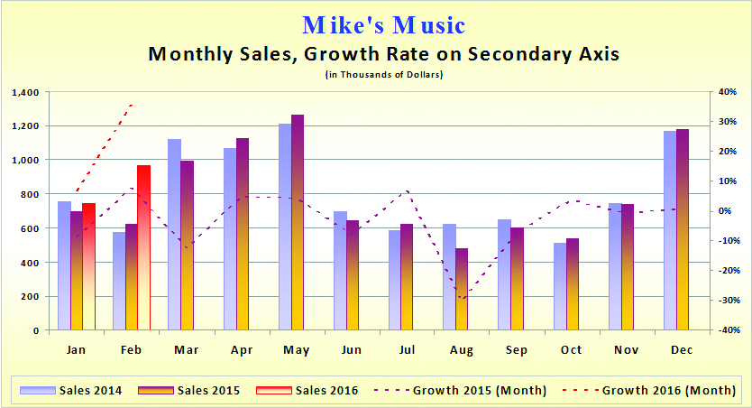
Note that the legend has more entries, and January and February markers for 2016 now appear on the chart. But the growth rates are so tiny compared to the rest of the numbers that the series can’t be seen. They need their own scale.
How do we select what we can’t see? Go back to Design view of the form. Double-click on the chart object, and select any object. On the far left of the standard toolbar is a dropdown menu. Click on the dropdown and select the first data series you want to change, e.g., Series “Growth 2015 (Month).” Then click on the Format Data Series icon located to the right of the dropdown menu. This opens a dialog box. On the Axis tab, change the setting so that the series is plotted on the “Secondary axis” (instead of Primary axis). Click OK.
Now that you can see the sales growth, right-click on the series and change the chart type to a line. Use the first subtype in the top row, which is a normal line with no markers. Next, go back to Format Data Series and choose the Patterns tab to set the line color as desired and change the style to be dotted. Repeat the process for the other growth-rate series.
When you view the chart in Form view, if all months aren’t labeled, stretch the chart object wider in Design view so labels can have more space or make the font smaller (see Figure 2).

Figure 3 shows the property settings. Unless otherwise specified, select Font = Calibri, Bold, 12 point. To change, right-click on objects and choose from the shortcut menu (pick Format for most options).

With these calculated indicators, it looks like 2015 wasn’t a great year. Under normal circumstances, the growth should have been better. Mike’s Music lost their marketing manager, which is reflected in lower sales and momentum starting last summer. Sales are picking up, and 2016 looks promising.
To try this out for yourself, download the databases for this month: Chart a Secondary Series 03-2016. Next month, we’ll create a stacked column chart showing monthly sales by product category.
SF SAYS
When you’re charting in Access and need to make changes, right-click on the object and choose Options from the shortcut menu.

March 2016


