How can financial planning and analysis (FP&A) professionals get the information they need to make good decisions? Through well-designed dashboards.
A dashboard is a visual interface that provides at-a-glance views of key measures that are relevant to a particular objective or business process. Like the instrument panel on a car’s dashboard, dashboard reports present a quick, comprehensive overview of an organization’s status and overall direction. But instead of speed, RPM, and engine temperature, the financial dashboard typically displays data such as total monthly revenue, operating margins, and per-employee revenue. In addition, like the car’s dashboard, these reports often display the equivalent of warning lights that flash when there’s an impending problem or when certain variables stray outside predetermined limits.
By using graphics, dashboards can help organizations focus on strategic priorities, make faster decisions, and improve return on investment (ROI) by enhancing value through crisp visibility and focus on revenue and cost levers. Telling a story simply and effectively through images makes it easy to communicate and collaborate throughout levels of the company—giving management more time to interpret the data and make critical decisions.
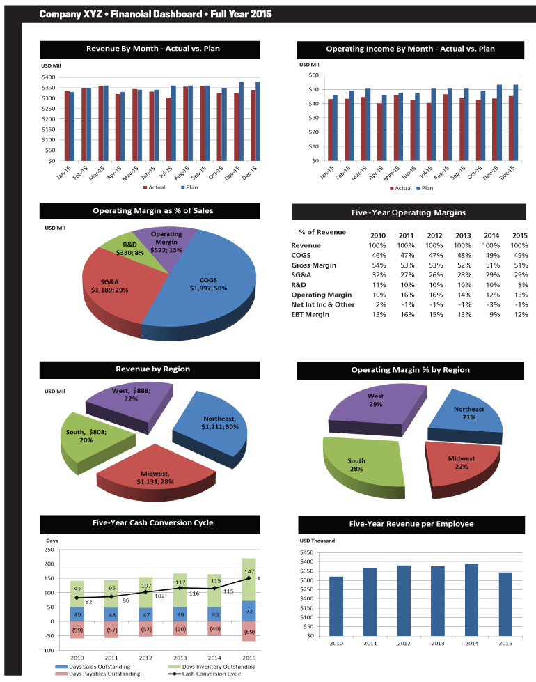
Why are dashboards so effective? The human brain processes numbers and images as discrete chunks of information. As a result, reports and tables filled with numbers are difficult and time-consuming to process. But we usually understand a single chart or graph immediately. When people see data as a “picture” rather than a table, they focus on what the dashboard is saying. (Figure below shows a sample dashboard and an explanation of what it can measure.)
CONSIDER WHAT YOU WANT TO COMMUNICATE
Before designing the dashboard, think carefully about the messages you want to convey, the audience who’ll utilize the dashboard, and how often you’ll need to update and disseminate the data.
It’s important to understand the audience and to determine what they need to get from the data. For example, board members and senior executives require a dashboard that focuses on information needed to make high-level strategic decisions. Operations leaders need a dashboard that focuses on detailed, specific, and technical information necessary to make short-term operational decisions.
It’s also essential that your audience take ownership of the data. That’s why it’s extremely important to include them in the dashboard design process and to present information that highlights key, actionable tasks. For example, if there have been changes in market share or in the mix of products sold and product profitability over time, the dashboard should prompt the audience to dig deeper to understand the reasons for the changes and what needs to be done to right the ship, so to speak.
Use consistent metrics that everyone quickly understands and that match your organization’s objectives, as well as charts and labels that the audience can understand easily. (An example of a strong label would be “Monthly Revenue—Actual vs. Plan.”) It’s also helpful to highlight important items to make sure the audience stays focused on the right elements. The goal is to convey the strategy and generate action.
Be sure to validate the dashboard with the audience on a regular basis to confirm that the metrics are still relevant since some of them may not be. In that case, revise the dashboard so it connects with your audience. Creating an effective and valuable dashboard requires a continuous improvement process.
WHAT MAKES A DASHBOARD GREAT?
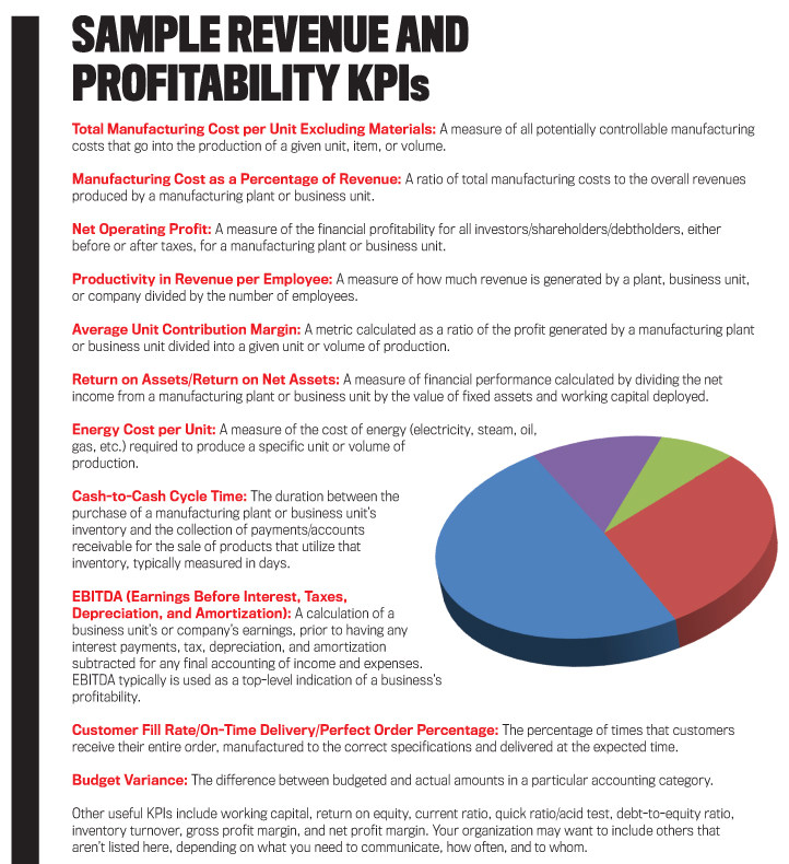
Most dashboards are designed around a set of measures, or key performance indicators (KPIs), that include tasks deemed essential to daily operations or processes and that help guarantee the success of the organization if performed well. By presenting KPIs in consistent formats, dashboard reports allow company executives to readily spot changes and trends in these measurements. (For more on KPIs, see “The ABCs of KPIs” and “Sample Revenue and Profitability KPIs”.)
Constructing an effective dashboard is no easy task: Most FP&A professionals struggle with selecting the right charts and striking the right balance between high-level visualization and detail. For this reason, it’s important to keep the content of the dashboard simple and specifically relevant to the intended audience. It should include only a handful of KPIs and measure how the business is performing against them. If you overload your audience with too many charts and graphs, you’ll risk losing their attention.
Also, developing dashboards is ultimately a presentation exercise, not an analytics effort. Effective dashboards use a variety of techniques from what are known as sparklines to color variations, but the key is to show how the data is related and how it provides shared insight.
Think in broad strokes when putting the charts together: What’s the overall trend? What’s the most striking comparison? Providing context is essential to dashboard creation. Visualization tools enable you to summarize data with averages, standard deviations, and upper and lower quartiles, allowing viewers to understand the data’s context over time.
Don’t be afraid to create different dashboards for different audiences based on the financial professionals’ area of expertise and ability to influence change. In any case, all dashboards should tie back to the core objectives of the organization, and the interaction should lead participants to ask the questions they need to ask.
DESIGNING THE DASHBOARD
Dashboards should portray information in a clear, concise, meaningful, and efficient way. As mentioned earlier, they’re meant to provide at-a-glance monitoring, which can be achieved only if the level of detail for each audience is kept to a minimum. If additional detail is required, provide it as a supplement to the dashboard. This might take the form of a bulleted list that explains large deviations in historical trend data, or it could be additional tables that drill down into department, customer, or product level detail to support an aggregated table in the dashboard.
Dashboard design and development is an iterative process. After you complete the initial draft and present it to your audience, invite their feedback as to how well the dashboard is working for them. Then incorporate this feedback into future iterations of the dashboard.
Consistency is important, too, so choose one or two display media and stick to them. If a single dashboard contains multiple display media, such as bar charts, line charts, or tables, the viewer will need to adjust his or her view and perception to absorb the layout and message of each display. Likewise, resist the temptation to make the dashboard too flashy or overdesigned with gauge-like graphics and widgets. As “pretty” as those may seem, they get in the way of the dashboard’s objective: rapidly and easily informing the audience. The simpler you keep your dashboard, the better.
After the design is complete, review the dashboard for overall visual appeal: Are the graphics attractive and easy to look at? Will the design provide a deeper understanding of the data? Will it spark action or create a demand for more information? Remember, the power of data visualization lies in its ability to drive strategic decisions by helping management find the answers to key business questions.
Finally, don’t allow the design of the dashboard to compromise the integrity of the data. Clearly state the source of the data, and ensure that it’s valid. If your data can’t be trusted, it’s likely your message won’t be trusted either. (For more about creating useful dashboards, see “Dashboard Quick Tips.”)
MAINTAINING THE SYSTEM
After you’ve completed your new dashboard and while your work is fresh, be sure to document the maintenance requirements, including who will be responsible for updating and distributing the dashboard, the frequency of updates, how often data will be refreshed, and what’s involved in doing all this. The process documentation needs to include how the reporting mechanism should be time-stamped, notes indicating when the data for the measures was retrieved, and descriptive titles of each component included in the dashboard.
Also, document the dashboard and the data model that supports it so that you remember how to recreate the dashboard when you return to refresh the data or when you pass responsibility for maintaining the dashboard to someone else. The data model details how data is documented, organized, stored, and accessed as well as describes the relationships among different types of data.
Data visualization will become more and more common among FP&A professionals as they realize the power of interacting with their data, especially as the amount of data expands exponentially. As this growth continues, the pressure to provide dynamic insight for management in actionable slices will continue to rise.
The current business environment demands a richer, more complex understanding of trends and indicators. Well-designed dashboards do this while providing the information necessary for effective decision making.

June 2016


