GATHERING DATA
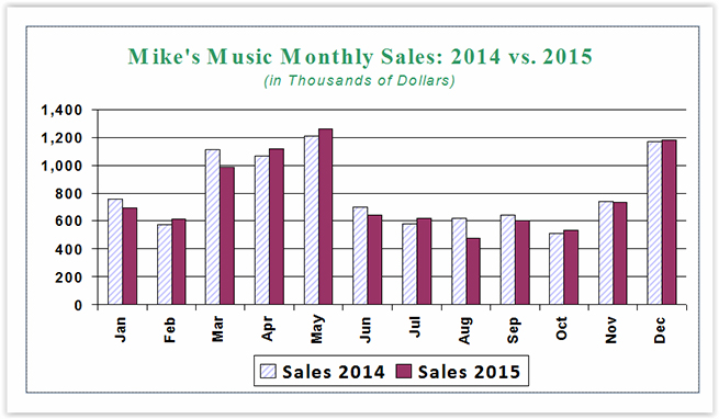
The chart (see Figure 1) has two data series, so it needs three fields: Months (x-axis), Sales 2014 (y-axis), and Sales 2015 (y-axis). The sales records are in a table called ProdSales, and queries are used to get the monthly totals for each year.
Begin with 2015. Make a new query based on the ProdSales table. Click the Totals button to display the Total row in the grid. In the first field, enter Mnth: Format(dtSale,“mmm”). The Format function converts the date of the sale, dtSale, into a three-letter abbreviation. This field, Mnth, will be the x-axis of the chart, with values from Jan to Dec.
In the next field, enter Sale15: Amount and set the Total line to Sum. Sale15 is the monthly sum of sales. In the third field, enter YrMo: CLng(Year(dtSale))*100+CLng(Month(dtSale)) and set the Sort to Ascending. This expression multiplies the year by 100, adds the numeric month, and converts the value to Long Integer. This puts the date of the sale into a number format (for example, December 2015 becomes 201512), which will uniquely identify the data and will be chronological when sorted.
For the next field, enter Year(dtSale) and set the Criteria to 2015. The Year function returns a year number from a date. This will limit the query results to sales from 2015 only.
The final field is Mo: CInt(Month(dtSale)). Mo is a calculated field. The Month function returns a number from 1 to 12. Since this field will be used to link results from both years, the data type will be explicitly defined using CInt to convert to integer. Save the query as “q_Sales_by_Month_2015_cht” and close it.
To get the results for 2014, repeat the process and simply change the Criteria for Year(dtSale) to 2014 and use Sale14 for the Amount fieldname. Save that query as “q_Sales_by_Month_2014_cht.”
COMBINE QUERIES
The next step is to combine the queries. Create a query using the 2015 and 2014 sales queries as the data sources. Since the data is going to compare sales by month, link the queries by Mo. Double-click the Mnth field from the 2014 query to add it to the design grid. In the second field, enter Sales 2014: Sale14. The third field is Sales 2015: Sale15. Finally, add Mo to the final field, set the Sort to Ascending, and uncheck the Show box. Save the query as “qCht_Compare_2015_2014.” This query will be the Row Source for the chart control.
Another way to create this query is through Structured Query Language (SQL). If you’re relatively new to Access or have never used SQL before, it can be intimidating. But don’t let that prevent you from trying it out. SQL is logical, so it isn’t difficult to understood and follow.
Here is the SQL statement for the qCht_Compare_2015_2014 query:
SELECT q2014.Mnth
, q2014.Sale14 AS [Sales 2014]
, q2015.Sale15 AS [Sales 2015]
FROM q_Sales_by_Month_2014_cht AS q2014
INNER JOIN q_Sales_by_Month_2015_cht AS q2015
ON q2014.Mo = q2015.Mo
ORDER BY q2014.Mo;
Note: “q2014” and “q0215” are aliases for the first two queries, abbreviating the names so they aren’t as cumbersome to refer to in SQL and other objects.
The main clauses used here are SELECT, FROM, and ORDER BY:
- SELECT identifies what data to get (or calculate).
- FROM specifies where data will come from.
- ORDER BY is the sort order.
The first field, Mnth, displays month abbreviations from Jan to Dec. It can come from either the 2014 or 2015 data since the tables are joined on month.
The second (q2014.Sale14) and third (q2015.Sale15) fields report the sum of the monthly amount for the specified year from each respective query. These fields have “aliases” (alternate name) specified after the “AS.” Square brackets are used around [Sales 2015] and [Sales 2014] because they contain spaces. This was intentional so the chart legend would include a space between the word “Sales” and the year.
Mo is used to link the 2014 and 2015 data, sort months chronologically, and does not display.
THE CHART CONTROL
From the Create tab of the ribbon, select Form Design. This will give you a blank canvas. In the Controls group, choose Chart. Click on the form to place your chart, and open the wizard. Select the qCht_Compare_2015_2014 query as the data source. We will make adjustments after the object is placed, so it doesn’t matter how you answer the questions until you get to the Chart title. Once that is set, click Finish.
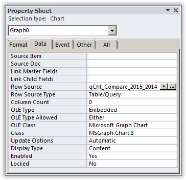
When the object is placed, the chart you see might look like data that has nothing to do with your data. Don’t worry. The chart doesn’t render until you switch to Form view. Before doing that, however, go to the Data tab on the Property Sheet for the chart control and change the Row Source to qCht_Compare_2015_2014 (see Figure 2). Now switch to Form view.

To edit the chart appearance, switch to Design view, right-click on the object, and select Chart Object, Open. This opens the chart in Microsoft Graph. Making changes works much like formatting charts in Excel. For the chart in Figure 1, the title and series colors were customized, and the format of the y-axis was set to #,##0, (the comma at the end divides by 1,000) on the Number tab of the Format Axis dialog box.
Next month, we will learn how to do a running sum in Access.

January 2016


