MORE BASE FUNCTIONALITY
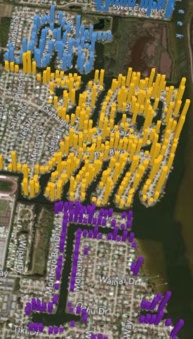
Two add-ins are now built into Excel 2016 directly. The former Power Map add-in lets you build a pivot table on a map. If your data has a geographic component such as ZIP code, address, or state, it’s a great way to visualize where your customers are located (see Figure 1). Look for the 3D Map icon on the Insert tab.
The former add-in known as Power Query lets you extract, transform, and load data into Excel. It offers a number of powerful transformations, such as combining files, unpivoting data, and an improved text-to-columns command. Find these tools in the Get & Transform group on the Data tab.
NEW CHART TYPES
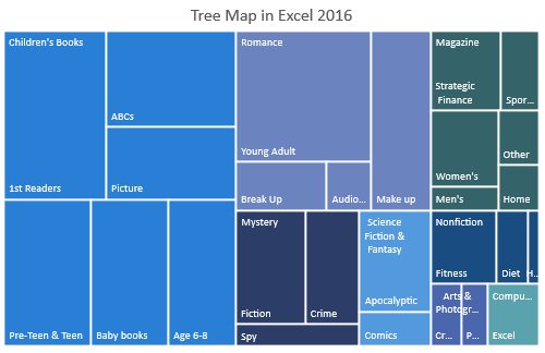
Excel 2016 includes a new charting engine that initially offers six new chart types: waterfall, box & whisker, histogram, Pareto, tree map (see Figure 2), and sunburst charts. For now, the legacy chart types still use the Excel 2013 charting engine, but they will eventually move to the 2016 charting engine.
Figure 2. Tree Map
AUTOMATICALLY ROLL UP DATES
If you add a date field to a pivot table, Excel 2016 will automatically provide monthly, quarterly, and yearly roll-up fields in the pivot table. For the feature to work, your dates have to span more than one month to get the Month field and at least a complete year (January 1 to December 31) or dates in two different years to get the Quarter and Year fields.
If you don’t like the additional fields, press Undo immediately after adding the date field to the pivot table. Excel 2016 will undo the grouping, leaving the daily dates in the pivot table.
If you really hate this functionality and want to turn it off entirely, there’s nothing built into Excel options. Instead, you have to use a registry key. To disable the Auto Group functionality, you can add a new DWORD (32-bit) Value registry key. Add HKEY_CURRENT_USERSoftwareMicrosoftOffice16.0ExcelOptionsDateAutoGroupingDisabled and set its value to 1.
MULTI-SELECT ICON
Slicers debuted in Excel 2010 as a way to filter a pivot table. It was difficult to select nonadjacent slicer items using a touchscreen. An icon in the top right of the slicer allows you to toggle into Multi-Select mode. When in that mode, there’s no need to hold down Ctrl to select multiple items.
FORECASTING WITH SEASONALITY
The forecasting tools have been slightly improved to handle seasonality. This feature looks great in the Microsoft demo, but it isn’t as robust as it needs to be in real life. Say you have a time series of data, such as sales by month for the last three years. Select the data and then use the Forecast Sheet command on the Data tab. Excel will insert a new sheet and produce a forecast of the future, complete with seasonality and a confidence interval.
Many data sets have seasonality. For example, a retailer will sell more in December than the rest of the year. While it’s great that the new FORECAST.ETS functions can detect one level of seasonality, this feature falls short because it can’t detect multiple seasonality factors. For example, the same retailer might notice that sales are strongest on Friday and Saturday and weakest on Monday and Tuesday. If your data has both weekday seasonality and monthly seasonality, the new functions won’t detect both influences.
The Forecast sheet inserted by Excel is designed to provide a model to show you how you might use FORECAST.ETS.CONFINT, FORECAST.ETS.STAT, FORECAST.ETS.SEASONALITY, and FORECAST.LINEAR on your own without relying on the Forecast Sheet command.
SEARCHES AND INK EQUATION
Right-click any cell in Excel and select Insights by Bing. Excel will search for the cell value in Bing and return the results to a research panel docked to the right side of the Excel screen.
The “Tell Me What You Want to Do” search box, which would help you identify the commands you need to accomplish a task, sounds like a good idea, but it doesn’t recognize most phrases. If you can’t remember that the Filter icon is on the Data tab, it could be helpful. But if you don’t remember the feature is called Filter, it won’t help.
The least useful feature is the ability to convert a handwritten equation to proper math syntax (see Figure 3). The finished syntax is simply a picture, and Excel can’t chart the resulting equation. To experiment, go to Insert, Equations, Ink Equation.
IMPROVING THE INTERFACE
This new release also undoes some unpopular changes that were made to the Excel interface in Excel 2013. The tab names—Home, Insert, Design—were in all caps. Excel 2016 stops screaming the tab names, returning them to proper case.
The Office themes in Excel 2013 were White, Light Grey, or Dark Grey and seemed to lack any color. A new Colorful theme in Excel 2016 brings the color back to the ribbon. Go to File, Options, General to change the Office theme.
Another annoyance in Excel 2013 was that any numbers that changed as the result of a calculation would appear to roll down into the cell, as if you were looking at a slot machine. This feature was so unpopular in Excel 2013 that it has been removed.
SF SAYS
Excel 2016 offers fewer new features than previous releases because resources were focused on porting Excel to Android and iOS.

October 2015


