I recall working as a data analyst and trying to come up with an interesting headline for every report. I would look for some trend or interesting fact that I could use at the top of the report. Insights will do just that, helping you identify what’s unusual about the data set.
PREPARING YOUR DATA
For the feature to work properly, your data needs to be in the correct format. Insights is expecting tabular data with no blank rows or blank columns. Every column has to have a heading, and no two headings should be the same. Insights won’t work if your data is nested, such as several rows of account data under each cost center heading. There also should be no merged cells.
The data should also include a date field, and those dates should be properly formatted as dates rather than text. If you have text dates, convert them to real dates using =DATEVALUE.
Check the number formatting for each column in your data set. In my first test, I had a data set where I had inserted a Sector field to the right of my Date field. Because I inserted a column to the right of a date field, the new column was formatted as a date. All of the data in the column is text values such as “Retail,” “Financial,” and “Manufacturing,” so I never noticed (nor cared) that the column was formatted as a date. But Insights is using those number formats in their logic. You need to check the number format for all text fields and change any that are erroneously formatted as a date back to General.
Microsoft says that Insights works better when you format your data as a table using Ctrl+T, but in my testing, Insights worked identically whether the data was a table or not. Provided you only have a single row of headings above your data, Insights should work.
Currently, Insights can only work with approximately 250,000 cells or less. For a quick approximation, select your data with Ctrl+*. Look in the status bar at the bottom of the screen for the count of cells that aren’t blank.
RUNNING INSIGHTS
Microsoft is slowly rolling this preview out to Office 365 customers. People on the Office Insiders track began to see the feature between December 2017 and February 2018. It will slowly roll out to more customers. To find the Insights icon, look on the Insert tab in Excel. Insights will appear immediately to the left of the Charts group. If you don’t have it yet, search for Insights in Excel Help and follow the links about Office Insiders.

To start using it, select one cell in your data. Go to Insert, Insights. If this is the first time you’ve used Insights, you’ll be asked to enable the feature. A few seconds later, the Insights pane will appear on the right side of your screen.
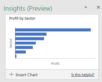
Insights starts with a few generic charts at the top. These seem to be the same type of results that the Excel 2013 Insert Recommended Pivot Table would have suggested: Profit by Date, Profit by Sector, and Revenue by Sector.

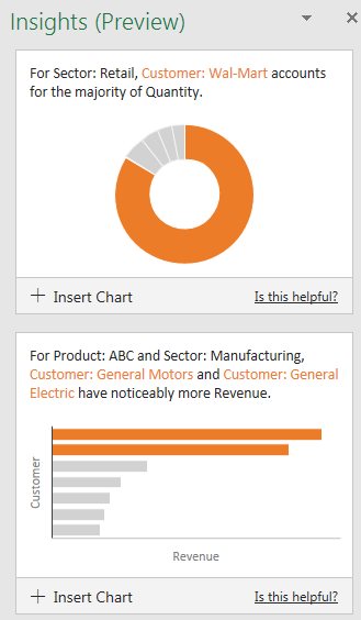
Below the first four charts is a link to see more charts. These later charts start digging into the details of the data, identifying things that are beyond what Excel 2013 would have discovered. For example, in a set of data containing a year’s worth of invoice data, Insights was able to identify that Wal-Mart makes up the bulk of the retail revenue in the data.

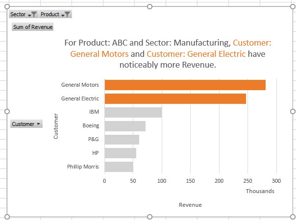
The chart tiles in the preview are too small to have chart labels, but clicking +Insert Chart will get you a full-sized version of the chart with those details. Excel actually inserts a new sheet, builds a pivot table, and then builds a pivot chart.

IMPROVING THE MACHINE LEARNING
Microsoft says that the Insights function will get better over time. For each chart in the Preview, you have an option to mark the chart as useful or not. For example, Insights identified that Payroll was my largest expense. I considered that to not be a surprise and marked that chart as not useful. I’m hoping that a week or a month from now, it stops reporting that fact.
Right now, Insights might detect the following in your data: summary analyses using pivot tables, rank, evenness, trend, composite signal, attribution, outstanding top two, monotonicity (always increasing or always decreasing), unimodality (having a single peak data point), and chart recommendations for smaller data sets.
In order to run your data through the Insights service, your data is going to be analyzed by a Microsoft service in the cloud. To read details about what they might do with the data, go to File, Options, General and look for the section about Office Intelligent Services. Two links there provide current details.

This is a new and exciting feature for Excel, but it isn’t going to be the only use of AI in Office software. Expect to see Word and Outlook begin using AI to suggest when your phrasing could be more polished, and PowerPoint is supposed to start using AI to help with slide design.
SF SAYS
The new Insights feature leverages machine learning algorithms stored in the cloud.

March 2018


